I think that this collection of type is very impressive, the aim of the type was to show how type was made up but using elements from the human body. It's like the anatomy of type. I would say that the target audience for this piece of typography would be a lover of pure genius type.
-------------------
Images found on Behance.net
The task with this graphic design was: Communicate the joy with Durex
Idea: Dont tell it demonstrate it
Solution: Type shows like x-ray, the inner feelings during the act with Durex.
This set of advertisements for Durex caught my eye because of the way they have used type as image. The words that make up the two figures are feelings you go through when using their product, i also like how they have used their logo to replace a certain body part, which is central in the page. The target audience would obviously be people who are sexually active, i think that this type of advertisement was probably intended for a younger audience, to show the importance of using a condom. The designs have been kept simple, in terms of how they have laid it on the page and presented the illustrations.
--------------------
Nuzzles wooden typographic puzzles.
I really like how original this idea is, using type in a 3D format, it makes it more interesting to look at and it becomes very interactive for the target audience. I think that this design products purpose is to be what it says on the pack, it is just a puzzle, but so different to what we usually know as being a puzzle, which makes it so unique. They have shown the ways in which you can interact and communicate with their product, which again makes it more appealing to their audience.
-------------------
This piece of kinetic type was designed for a farewell show on the NBC, the camera moves over the type at different angles. The type is segmented and it looks as though everything is on the same block, but as it moves around the segments change. It's a really clever way to present a lot of information in a more creative way, it's engaging and keeps your attention because it is constantly moving around.
------------------
Pablo Alfieri
I picked out these 3 particular pieces of Pablo's work because they are an approach to graphic design that i find inspiring. The hand made effect is something that i enjoy, and i feel that it has a more personal touch to it than purely digital. I picked out a piece of advertisement that he designed for MTV because i wanted to show the range of work that he creates, i also feel that although it is digital it seems to have a hand made feel to it, his work looks fun and bubbly.
------------------
Pop up wedding card
I found this pop up wedding card on behance.com, again i chose to add it to my collection because it has been hand rendered, the design of it is very clever and engaging. They have made it different from normal wedding cards by adding the 3D element to it. I just hope i receive a card like this one day.
------------------
YLLV/ self promotion of Karol Gadzala
This self promotion work really caught my eye because of the typography, it almost looks like rolled gold, she has used this as part of her identity and it is a constant theme throughout her self promotion project. It's good that she has kept visual consistency because when people have started to look at her portfolio and come across this type they will remember it and when they see it again some time they will know its her work.
--------------------
Make it better project, by Sebastian Baptista
I love this! It's so clever, i couldnt take my eyes off of it, it is so engaging and surprising, you dont know what is going to happen, which is why i think it works so well. The amount of transitions that take place throughout the animation keeps you wanting more, its very creative and fun. It is very inspiring because of the amount of experimenting they do to 'make it better'.
-------------------
Accept and proceed project by Roan for Nike
I particularly like the illustrations on these Nike advertisements, the type becomes part of the illustrations rather than a separate thing, its bold and lively, which is what Nike try to put across to their target audiences of sports fanatics and active people. Even their tag line 'Just do it' makes you want to just do it, they put across that their brand gives you the power to do whatever you want to do.
-----------------
Written portraits; project by Van Wanten Etcetera for the Dutch book week campaign
These series of designs reminded me of a visual language session, where we manipulated books to communicate a message (which unfortunately i was rubbish at). The designer has cut into books to create faces, now im not entirely sure if the images have been photoshopped or if the designer actually sat there and cut into these books/ laser cut them out, if they did then thats pretty amazing. Seeing as the designs are for a book fair, im guessing that the faces could be authors that will be at the fair?
-------------------
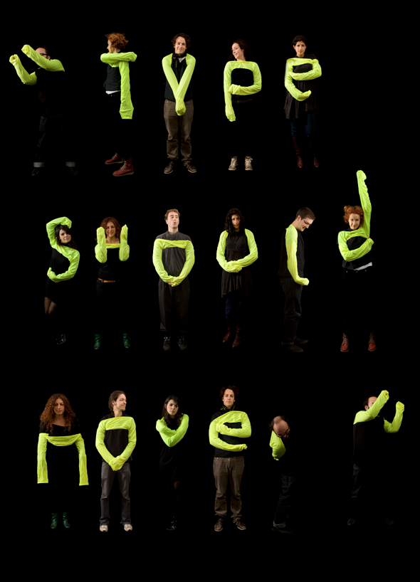
Letterform for the Ephemeral; project by Amandine Alessandra
There is so much inspiring graphic design! This type is made of people and their body parts (mainly arms), they have a florescent garment on their arms which stands out against the black background. I like the first image, what it says relates to how they have communicated it.
-----------------
Nike
Here are some Nike t-shirt designs that i found on behance.com, the style is very futuristic and this reflects on the trainer itself, the man used in the design has a large afro and he's meditating or dreaming, he could be dreaming about the shoes. The trainer is surrounded by space objects, such as rockets and spacemen, so im guessing they are trying to present their shoes as 'out of this world' by the imagery that they have used, or at least this is what it is being communicated to me. The t-shirt designs are very colourful and bold, which again reflects o the personality of Nike.
--------------------
This Bacardi advert is very dramatic, in the way they have used imagery, i think this is because of the liquid that is whirling around with the bottle standing central. I think the whirling liquid could be representing the taste of the Bacardi and how it makes you feel. The ad is obviously aimed at over 18s who drink.
---------------------
Alexis Marcou
The set of designs were created for the Velvet Fashion club, a few designers have created their own versions representing the club. I chose the one above because i like its simplicity, it shows a broken mannequin, i think its the colours and the jagged shapes that caught my eye, the triangular shape at the top of the image leads your eyes down to the main bulk of the design. I think this would attract fashionistas as the imagery used is appropriate to its purpose.
Eduard Muresan
I like how the imagery in this one is a lot more 'free', the image is very sketchy and loose yet the form of the mannequin is still visible. It kind of plays with your eyes.
Alexandru Cristea
This design is a bit more out there, the imagery used is colourful and crazy. It catches your eye more than the others in my opinion because of the abstract image, although i dont see its relevance to fashion, unless this is promoting fashion thats 'out there'.
Bram Vanhaeren
This one uses the mannequin again with a dream like effect, the grey tones really make the coloured diamond stand out, i think that the diamond could be the clubs symbol or logo, so they highlight a lot through the designs. I can see the relevance of this design in terms of fashion as the mannequin was incorporated. It could be that each design is representing a different area or style of fashion, whether it be sophisticated, casual or just plain crazy.
Velvet fashion club
--------------------
Global warming campaign; project by Ferdi Rizkiyanto
This design is so simple but it is such a brilliant idea, its to promote global warming and the effects it could have on fish. The imagery obviously represents the pollution in the water, i think its good how they have used humour to communicate something quite serious, i think this approach is more likely to capture peoples attention about the subject of global warming, as its light hearted but in a way still serious.
---------------
Antismoke pack; project by Reynolds and Reyner
These cigarette packaging designs are very cynical and blunt, they are clearly shaped like a coffin. This is to try and shock people into understanding or realising the effects of smoking. It's a good way to package them because of its bluntness. I think it would be more successful than the current cigarette packaging where they put on the grim images of deceases caused by smoking.
-------------------
Doc2dock SOS; project by Michael Cina
This video uses boxes with text on to show how easy it is to transport aid to poorer counties, the way in which they have showed the process is so much more creative and effective than something like a poster or leaflet, it makes you want to watch it.
----------------
Pepsi; project by J Kaczmarek
I really liked the floral design on this pepsi can, its very summery and refreshing, much like the drink i guess.
-----------------
Design Museum x state of the obvious collection; project by Mash Creative
This collection from the Design Museum is probably one of my favourite pieces of design, it is so simple! They have used just black and white and labelled all these different items with what they are, they are stating the obvious! I think its often that the most simple designs are the most effective.
--------------------
Norvegia 2007
I particularly like how the text has cut out the photo in the background, you can still see what it is because the text is very subtle, its a nice simple design, contemporary and clean cut. The poster is representing an event that happened in 2007.
-----------------
Write a bike; project by Juri Zaech
Another clever piece of design found on behance.com, these are designs where you can have your name transformed into the frame of a bike. They can be personalised to any name, which means the target audience is quite open.
-------------------
Sydney film festival 2010; project by Boccalatte
These poster designs are for the sydney film festival. I think i was drawn to these because of the dogs. I love dogs! I think because they have used such a variety of different dogs that it just makes the poster so much more interesting, they dont just use a retriever. I think the purpose of the dogs is because they have used the tagline 'unleashed' and the dogs are unleashed in the designs. The stance of the dogs also create an atmosphere, if i were to guess what film genre each dog was representing i would say: the top left dog is a smarmy, sophisticated love story because the dog looks very handsome and the set in the background looks upper class. The top right film would be a light hearted comedy because the dog just reminds me of a bubbly, chilled out person. The bottom left looks like a gangster film, the dog looks very intimidating sitting on the box with a light on, it looks like he's about to interrogate you. The last one looks like a film about an old man, where you learn about his life.
------------------
Cadbury's print campaign
Nike Hyper Dunk series
Momentum, Nike poster
Alex Trochut is one of my favourite designers, his work is so original and fun, he works a lot with typography. His work can be very playful. I chose to look at his work, and in particular the top two images because of his inventive type, both have been designed for a specific brand; the top being Cadburys and the other Nike. The Cadburys typeface is instantly recognisable because of the colours used and the way he has represented the fresh milk they use in their chocolate.
------------------