For the speaking form experience brief i decided to look at packaging, below are packaging designs that i find inspiring and i think are generally good design. I googled packaging design and found some good images, i then found the websites and designers of them.
Jessie Kirsch packaging
This particular design caught my eye because it is a series of boxes, which was my original idea for the brief. I like how simple the design is and how they have used colour to coordinate. The boxes are for soap, and the soap colours match the colours of the boxes.
---------------
Design by Mirko
This designer creates very bold, yet sophisticated packaging. I particularly like the crisp packaging at the top because it is light hearted and quirky. The wine bottle designs look very slick and sophisticated which im guessing reflects on the wine itself.
-----------------
Tree hugger, sustainable packaging
I looked at the above designs because i was going to use brown paper within my designs but decided that they would become too fussy. Its really clever though how the t-shirt comes in the packaging which then turns into a sustainable card coat hanger.. genius.
------------------
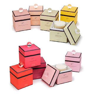
Parlour by Tiger print
These packagings are for candles, the designs are very elegant and simple, i like how the elegance of the packaging design flows through into the content of it. This style isnt really one i will use as influence in my own designs because i feel its too fancy and not at all light hearted.
-------------------
Gubble Bum packaging
These bubble gum boxes are so cute! Its amazing what effect a face can have on a box or an object. The faces give the packaging a personality according to the flavour of the gum. I also like the bold use of colour and how simple the whole design is.nice.
Jonathon Adler at Design-milk.com
These are a series of packaging designs to hold small monuments, again the design on the outside reflects perfectly on the content of the boxes. I really like the moustache box and the shapes and colours on the whale packaging.
-------------------
Koormann.com
These juice boxes are a clever design, the packaging represents the juice inside, making it easy for a consumer to pick the right flavour dependant on the colour of the box. I do really think this is good design, its simple yet such an obvious idea.
------------------
Luxury packaging by Betc, trendland.com
--------------------
Shannon Rose design for Lazy Dog cookie company
---------------------
Fat big chocolate company packaging
The above design is similar to what i wanted to do for my final piece. This sort of design really inspires me, i love simple yet effective design, the whole thing is really bold and light hearted. I also like the type they have designed with the pigs tail on the g :)
------------------
Packaging design for Kanpyo Udon by Nosigner
My eye was drawn to this design because of the paper bags, all they have done is added loads of handles but it makes such a huge difference. It may not be as practical as having one pair of handles but it makes it so much more interesting to look at!
------------------
Pack of love at lovelypackage.com
Askinosie chocolate packaging design
Clipper tea


No comments:
Post a Comment