Monday, 5 March 2012

YCN// HEINZ Salad Cream..

I went onto the Heinz website to gather some information about salad cream and to see what range is available. Salad cream does many different variations. They have their original, which comes in a glass bottle, a plastic bottle, a plastic bottle that looks like the glass bottle and then smaller bottles which are the new shape. There is then the different salad cream varieties which include the Original, Light, Extra Light, Lemon and Black pepper and Cucumber and Dill.


http://www.heinz.co.uk/ourfood/sauces/saladcream/salad-cream

--------------

HEINZ Salad Cream slogans//


'It has to be HEINZ'

'Any food tastes supreme with Salad Cream'

'Pourable sunshine'

'Bring on the Zing'

------------


YCN// HEINZ adverts..

Research


YCN// Travel size and sample size food research..

As part of mine and Lisa's initial ideas, we were thinking about sample sizes and how we could re- package them and distribute them. There are so many different types of travel and sample sized products. I first looked into what sample sizes salad cream had and then looked into other products.

Images again are taken from Google images//


http://improhosts.co.uk/espromotions/shop/images/uploads/Salad-Cream-25g-Plastic-Pot.jpg

Simple dipping pot with peel away lid. Many sauces do this now and also businesses such as McDonalds and Dominos.


http://www.selectcateringsolutions.com/shop/image/HZ%20SACHET%20Sld%20crm%20(339%20x%20768).jpg

They then have a small sachet. Again many sauces can be found in this size, mainly ketchup, mayo, vinegar, mustard and salad cream. These would be found in pubs and cafes mainly. I dont really see salad cream that much in pubs or cafes because it doesnt seem to be as popular as other top sauces like ketchup and mayo.


http://www.jjfoodservice.com/images/products/large/SAU114.jpg

This squeezy salad cream looks like a much more modern packaging. It looks more interesting due to the shape of the packaging and it looks easier to use. The problem with sachets, even if you do squeeze them, they are either really hard to open, they dont open properly or they squirt all over you.


https://blogger.googleusercontent.com/img/b/R29vZ2xl/AVvXsEj1px-d41KOS_CqLVGQdlYMvluxXFYYSpgWnlzLjKpmtZxoo8f2BU4MwmTP43yrU8HV3KSg_F7zoZQ9JZrnW2b56l18u62PfKuNVHlDhyORJ6nDfVz3aSdfExQPF2nrMY4cp_hyphenhyphen9aDvxMKk/s1600/heinz.jpg

This is probably the cutest bottle of sauce I have seen. It is a mini glass bottled Heinz tomato sauce. I would buy it just for the bottle!


YCN// HEINZ Salad Cream adverts..

After looking at digital advertising for Heinz Salad Cream, I have started to look at more printed based ads. I found most of these through Google images. Not all of these are official Heinz adverts but I do feel some of them actually work better than the Heinz adverts.


http://www.frederiksamuel.com/blog/2007/12/heinz-salad-cream.html

These were a set of designs that I found that have been designed to fit with the slogan 'Pourable Sunshine'. The designer has used the a pouring salad cream glass bottle as the sun, and then used salad foods as plants, like trees. I think they are very clever yet oh so simple. They get straight to the point and make salad cream feel very summery and refreshing.

The only thing I would say that I dont thin works that well is that all the food is salad related which doesnt really show how diverse salad cream can be.


https://blogger.googleusercontent.com/img/b/R29vZ2xl/AVvXsEia7WxXO167hdZfJi7Vp29Y8VsynRjNkm8jlhqKTS02KRb5xSECAaGivOyzirDIb6QendKl0HPqSLOW1bEGfqfnBB9OsfI9-eCCfKKTUxQBKVQSFm2cDhx9BCTkeMYzbzCNVD5FV7wC7K8/s1600/calum.jpg

This has also been designed by someone outside of Heinz. This ad works well because it is showing how much better salad cream is than tomato sauce. Heinz tomato sauce is so famous, it literally is the only tomato sauce that should be used, so its funny how they have knocked it out of the water and made salad cream number one!


http://files.coloribus.com/files/adsarchive/part_194/1945005/file/salad-cream-grub-small-14938.jpg

I am not entirely sure if this is official Heinz advertising but it works well. These series of adverts were based around the slogan 'Any food tastes supreme with Heinz Salad Cream'. They basically show gross things or things that you wouldnt dream of eating and promote that you can eat anything as long as you eat it with salad cream. People do actually eat grubs but they taste horrible, Heinz are saying if you dip it in some salad cream then you'll love it!


http://files.coloribus.com/files/adsarchive/part_346/3465605/file/salad-cream-sausage-small-26980.jpg

This is one of my favourite ads from this series. They have made a big sausage look like dog poo and then said you can eat it as long as you add salad cream! Once you realise it is actually a sausage, you laugh!


http://files.coloribus.com/files/adsarchive/part_971/9716055/file/heinz-salad-cream-heinz-aquarium-small-16968.jpg

This is another funny ad, showing that they have eaten their pet fish with their chips and of course salad cream! They dont even need to explain the image, the audience interprets it as they will, and they will obviously understand and laugh. I guess in a way Heinz are taking the mick out of themselves by saying that you can eat it with literally anything, but then again it is showing just how diverse and yummy it is!


http://media.heinz.com/media/ourfoods/products/1024x768/saladCream_2.jpg

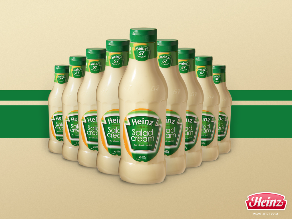
This ad is pretty simple, just showing lots of salad cream. The colours work well though, all keeping in line with the brand. Not too sure about the red logo, but then again you couldnt have it green or cream or you wouldnt notice it.


https://blogger.googleusercontent.com/img/b/R29vZ2xl/AVvXsEhSA0LZREHvnVppZ5YDkbigHrZYC4qCa9iDo1O1Y6fJQkpswAI1peGkSrGxQc86-7h1Vls1x6v9whv3eEZYZB3hNoDiOxW-ZHYBpiy9dOxvARuIwgBu3Fc2wEHtqKzB6MqE1ny71Ji6PnE/s1600/holly.jpg

I am unsure on whether this ad works or not, I guess it depends on what they are trying to communicate. When they say 'Perfectly unexpected' I am guessing they are talking about the zingy
taste. 

This reminds me of a recent Argos TV advert//


http://www.heinz.co.uk/media/3761/Salad-Cream-Range-420x162.png

I got this image from the Heinz website, it shows most of their range (not including the Light Salad Creams). I really like their new slogan which is 'Bring on the Zing', the design works really well. It has a very young and fresh vibe to it which I think could work well with our campaign. Salad cream has recently bought out two new flavours and I think that this new slogan is for them.

YCN// HEINZ Salad Cream video adverts research..

After first deciding on a brief, of which me and Lisa chose the Heinz Salad Cream one. I started researching into existing salad cream adverts and campaigns that would help give me an insight into what approaches Heinz have already taken and also find out more about how they target their audiences, who are their audiences and what is the tone of voice they use.

This is a very important part of my research as I need to establish how Heinz work and where they are potentially 'going wrong' when it comes to targeting an audience of 18-29 year olds.

The first thing that I have looked at is TV advertising. Tv has a huge impact on our lives, most people own at least one TV and adverts are cropping up all the time trying to get you to buy or invest in a service or product. We are bombarded with advertising on a daily basis, so how does Heinz approach advertising to engage with their target market.


The first thing that I started to notice with Heinz Salad Cream adverts was that they played a lot on humour. They use salad cream in funny, real life situations. This advert is what appears to be a student cleaning his room and finding an old bit of pizza under his bed sheets. When he first finds it and inspects it you expect him to throw it in the bin. He takes the pizza downstairs and gets out his Heinz salad cream and squirts it all over the pizza slice and then eats it!

The best part about this advert that really works is the fact it is funny. Humour in my opinion is the best way to engage with an audience, I feel if you can make someone laugh then your on to a winner!
This appears to be the only ad I could find that was targeted at a student age


This advert is targeted at an older generation and in this instance a couple. The woman has a face mask on with cucumber over her eyes whilst her husband is making a sandwich. The phone starts ringing and the man wont answer it so the woman takes her cucumber off and leaves it on the side. The husband then takes the cucumber and adds it to his sandwich, he then smothers it in Heinz Salad Cream and eats it!

Heinz are again pushing the idea that salad cream will make anything taste good. The thing that I most liked in this ad was the fact that they used a married couple, it makes it funny how the wife was taking 5 minutes out but still had to answer the phone because her husband was too worried about eating! Says it all really.


This again is a funny joke. In a way its being a bit stereotypical but in a funny way. The tramp goes into a corner shop asking for his usual bottle, which you would automatically think was a bottle of alcohol. But instead the shop assistant hands him a bag with a bottle of Heinz Salad Cream in it! He then spots a bin with old food in it and gets stuck in, because 'Anything tastes supreme with Heinz Salad Cream'!


This advert is amazing to watch. The guy eats a billboard poster of a Heinz Salad Cream advert by covering it in salad cream. He actually ate it! This is a very exciting way of engaging with your target audience because it is so amazing! If I didnt like salad cream, this advert would definetely make me try it out.


This was one of the much older adverts for salad cream, its really simple but I would definitely say it is targeted at a much older audience.

The thing that works well with these adverts is the fact they use humour, it is a very successful tool to use. Heinz said in their brief that they wanted their salad cream to become more appealing to a younger audience. I dont know if they have tried this and are going the wrong way about it, or if they are just focusing on those customers who have been buying into the brand for years.

Obviously these adverts arent campaigns, they are just shown on TV to promote the product. We have been asked to create a campaign that will kick of the promotion to a younger target audience. We can use the fact that salad cream adverts try and be quirky but make it so that this 'tool' is used to engage with 18-29 year olds.

Wednesday, 8 February 2012

Design for digital// Top 10: Character design research..

I have been looking at different character design approaches to help me with the designing of my character for my sequences.


http://www.behance.net/gallery/EarlyBirds/2941281

This is a good example of the sort of character I am wanting to create. They are very simple designs and the character has been designed to be adaptable to many different situations. He is vector based and the colours have been kept simple.


http://www.behance.net/gallery/How-to-build-you-own-robot/2966457

I am wanting my character to have very simple facial features much like this Robot. I think that the really simple facial expressions that just use eyes and a mouth work better than characters with a lot of facial detail. But this obviously depends on the context of the character.


http://www.behance.net/gallery/Chimere-Semantiche-1/2679939

This is another good example of simplicity in character design. The designer has picked out important features of the pig and then focused on those rather than added loads of detail to every part of the pig. If they wanted they could have picked out one feature that we all know is relevant to a pig and we would know what it is. As long as you simplify something in the right way then it will still communicate the original, more detailed version.


http://www.behance.net/gallery/Identity-for-a-pizzeria-in-the-mafia-style/1005089


A lot of the simple character designs are vector illustrations, so this is a good starting point for me. I know that I could hand draw some ideas and then re create them in Illustrator. Colour seems to be kept very simple within these designs too.


http://www.behance.net/gallery/Booster-energy-drink-4-pack-box/2977257


This is a good example of how I am going to create my character. I want the shape to be very simple and not resemble anything, I guess I kind of want it to look like a marshmallow! This character has arms and legs and a very simplified face. I dont think that I would want my character to have arms, I want him to be as simple as he can.


http://www.behance.net/gallery/Were-a-happy-family/1077309


Just thought these were so cool :)


http://assets.subtraction.com/images/uploads/2010-08-23-day-and-night.png


These two characters designed by Disney Pixar are amazing. They are part of a short animation where the are jealous of each others life, one is day and the other is nigth. In the end they share their different lives and come together to watch the sun rise. It is a really lovely piece of short animation that gives me goosebumps! The characters in this are literally just blobs with arms and legs but it works so well, especially with the details that are inside them.


Design for digital// Top 10: Music..

Music for my Top 10 sequences//

Below are a selection of the soundtracks to the film The Bucket List, of which I have used for audio in my title sequence and idents. I decided to use music from the soundtrack album to this film because the film is about the same thing i have done my Top 10 on. There is no words to the music, they are just very inspiring pieces of music. They are quite upbeat jazz and the ones below have been specifically selected to suite the tone of voice I am communicating in each sequence.


This piece of music was selected for my title sequence and my skydiving ident. The reasoning for this selection was that the music is very upbeat and happy. This combined with the imagery of the sequence and the character, it just suited and made me laugh. the music is very light hearted and that is the tone of voice I am aiming for, I want my title sequence and idents to be inspiring and fun and the music I have chosen here really helps to elevate this.


This music was selected for the mountain climbing ident. I chose this one because it seemed to have an adventurous feel to it. It was still very upbeat but in a different way to the one above. This is probably the ident that makes me laugh the most because of the music. I think the music has become a very important aspect of my sequences and if I had chosen the wrong audio it could have completely changed the tone of voice and possibly even ruined the sequences.


This music is for the tattoo ident. I think this audio works really well because its quite a mellow sound. This suites the sequence but in a different way to the others. When watching the sequence with this music it makes it seem as if the character is clueless/ unbothered by the fact he has just got a peace symbol tattooed on his bum cheek! This makes it even funnier to watch because the facial expression of the character never changes, the music is the expression of the character when he takes part when he takes part in these activities.


This song is for the scuba diving ident, its a very jazzy piece of music, almost classical jazz. It has quite a slow beat to it but its still upbeat. I chose this audio for this ident because of this reason. It suites the fact that he is bobbing along the sea without a care in the world.