Wednesday 5 December 2012

Organic paper


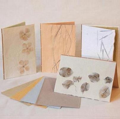
I have been looking into using organic paper and card for my nature inspired cards. There are so many different types with different textures and colours. I do believe they are called Mulberry papers which is where organic material is combined with the paper pulp before the paper is made to that the fibers and bits are entwined in the paper.


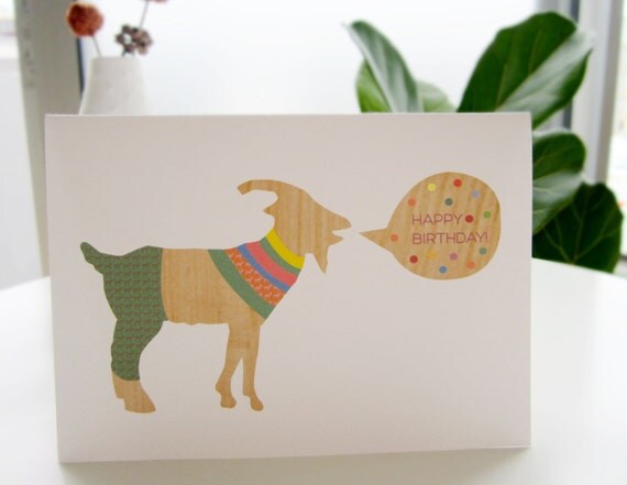
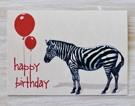
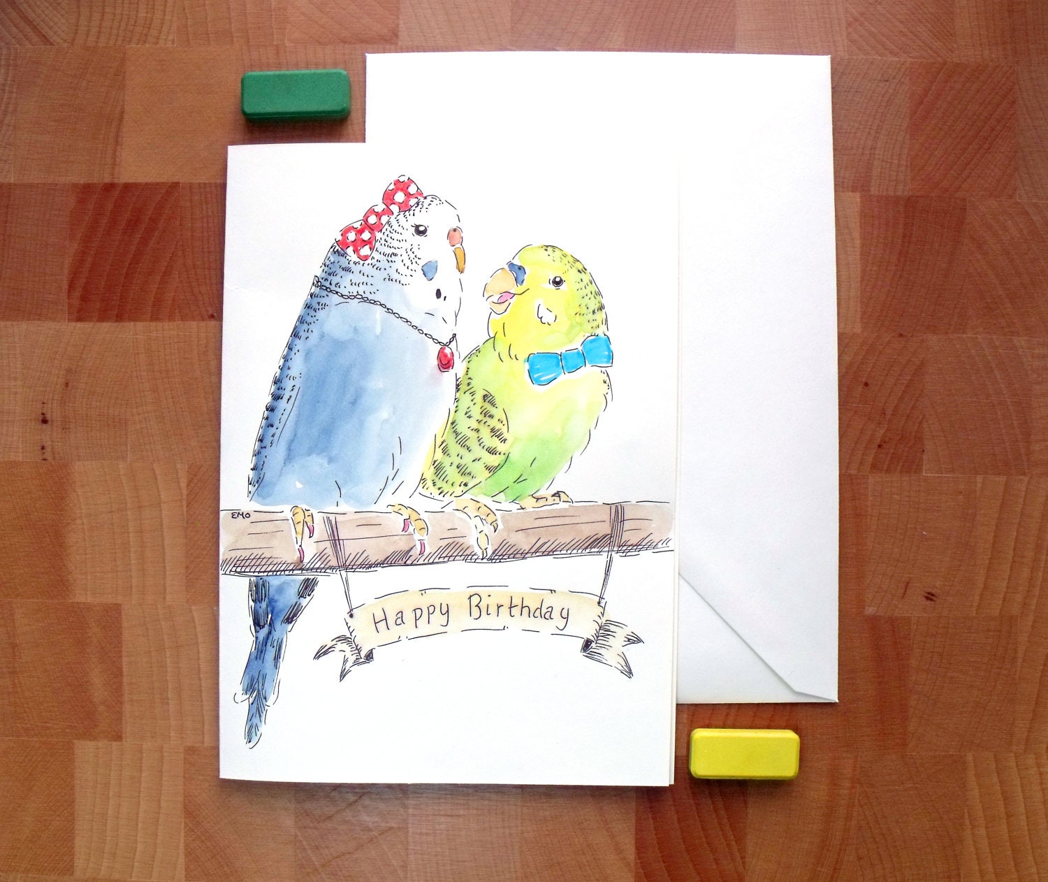
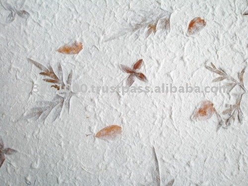
Im not sure on what sort of Mulberry paper I will want to print on, seeing as my cards are animals I think it would be appropriate to use one that has petals and leaves in it as these link with the habitats of the creatures.


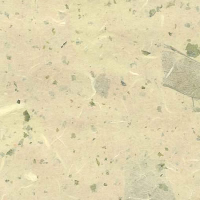
I think it may work better with a light coloured card so that the design can be seen but also if it has leaves and petals in it of different colours then you will be able to see them more clearly.


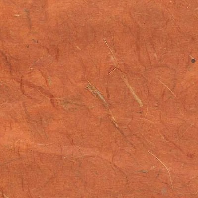
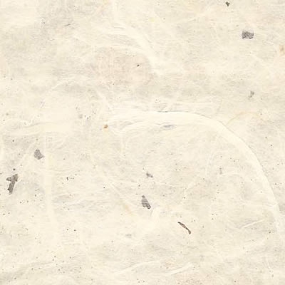
I quite like this one with smaller parts in it, it may make it easier to print on if its like this because if it is big leaves and fewer of them, my design maybe lost in them if I print directly on them.


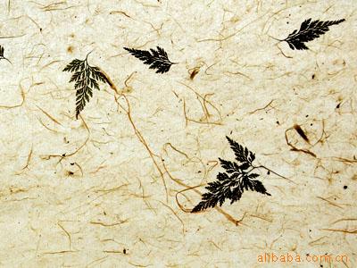
I do really like how there is just one big leaf and the rest of the paper just contains fibers, this means I would be able to place my design based around this so I dont lose any detail.


Leaves like this tend to sit on the surface of the paper which means when it came to printing and folding the card, it might just peel off.


I really like the darker leaves on this paper against the fiber background, not sure how well it would print though.


This sort of balance between fibers and petals works well on the light background and is probably something that would work well with my designs.


There are lots of different ways to make Mulberry paper and you can add almost anything you want in terms of organic material. These little love hearts work well against the white and could be used for a Valentines Day card.


These leaves were coloured before being placed in the paper, the subtle colours look really nice, I think this paper could work well with vectored images to contrast against the pastel colours and organic texture.


When I select stock like Mulberry paper im going to have to make sure that I check each piece to ensure that the print wont simply peel off with a loose petal after a while.


I would have loved to have made my own paper because I could have added elements more relevant to the imagery, I could have even tried adding feathers to see what they came out like.


You can make Mulberry paper as thin or as thick as needed which opens up more opportunities to add different fibers and materials.


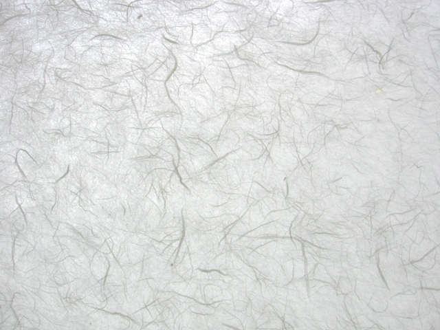
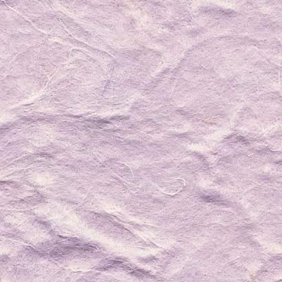
I think that the fibers work well as you could add different types, from thread to hair just to change the consistency and texture.


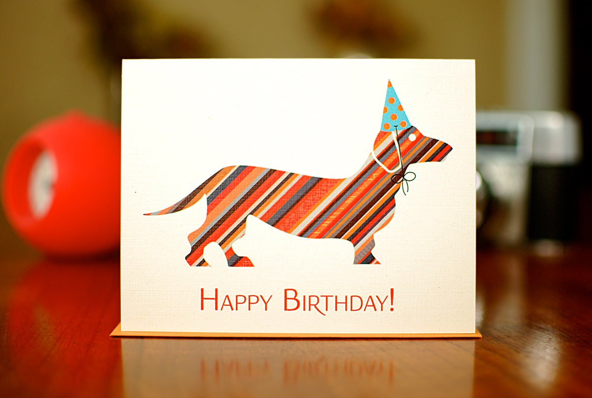
The stock for my greetings cards is going to have to be quite thick so that they can be stood up properly.


It would be interesting to experiment with making some parts of the paper thinker than others to see how this would effect the design printed on top.


There is an endless amount of things you could do with Mulberry paper, even just thinking about how many different types of leaves there are would give thousands of ideas.


It would also be very easy to add colour to the paper which means you could colour it to your needs if made fresh.

Hand made greeting cards


I am wanting to create very organic cards that fit with the theme of nature, so I have been looking into different stocks to print on and ways to utilise them. This cut out with colour underneath works really well, it looks very delicate and is appropriate for the butterflies.


I love this very organic paper, it has leaves and petals in it which basically combines real nature into a stock that can be printed onto. It would be interesting to see how well these would print onto.


I love all of the different elements in these cards, using stitching, organic brown card and by the looks of it possibly screen printing works really well. It has a very organic, handmade feel to it, very personal. Screen printing is something I could consider printing my own card designs.


I like how this one is completely hand made using different papers to add detail and colour. I imagine this took a long time to make the outcome reflects on this and they look really good.


I love the simplicity of this design and how the boat stands out from the rest of the card. The stock also works well, its almost like grey board but brown.


I think it could also work by giving the card a textured background to make it look organic.


I am really liking simple line drawings that are printed onto organic stock, they come out so well.


This again looks like it has been screen printed and it obviously works very well. I would really like to screen print cards as I know how nice screen printing can look, but its just a matter of will I have enough time?


Tuesday 4 December 2012

Animal greeting cards

Hand Drawn Animal Birthday Card - Fox with Painted Antlers - Handmade Card

There are so many different types of greetings cards out there and there are a lot of animal ones. Some are cute and some are funny. There are so many different design approaches available too which gives anyone the opportunity to do something creative. Some are very traditional like hand drawn and water coloured. They have a certain charm about them.

Animal Birthday Card

Others are vectored and feel very contemporary, but this can still be done in a unique way.

Happy Birthday Card . goat wishing you a happy birthday. unique cute colorful handmade card 4.25 X 4.5"

You can pretty much be as crazy as you like with greetings cards as they are for people and people are individual. I am a fan of very simple and funny cards, something that doesnt try to hard but hits the spot and makes someone smile.

Gift Card - Happy Birthday Zebra

I love how this design has combined different types of traditional design. The zebra looks very realistic whilst the text and the balloons have more of a hand drawn feel to them.

Animal Greeting Card - Budgie Drawing - Birthday Card - Hand Drawn Greeting Card

I think that hand drawn designs have more of a personal feel to them, someone has not only thought of the idea but then worked hard to bring it alive using a traditional method. Yes the original may have been scanned in to reproduce but the initial concept of traditional design is still there.

Happy birthday Party animal- hand printed birthday card

Even though this design look digital, it looks as though they may have used a tablet to draw it which still gives it that hand rendered touch. I really like the splashes of colour with the white card and white characters.

Candy Striped Doxie in Party Hat Happy Birthday Card (100% Recycled Paper)

You can be very abstract with greeting cards and combine different elements that may not usually work together.

Happy Birthday Card.  Birthday Bear.  Print of my Original Watercolor Painting.  Birthday Card for Men.

I really love the hand drawn type on this card, it suites well with the bear who is very charming.

Jurassic Panda Birthday Card

Random cards work very well like this one, who would have thought a panda and a dinosaur card could work so well. It is just something you would not expect and I think this is why people buy them, because they are different.

Happy Birthday Card 'Happy Birthday to Ewe'   A hand drawn greeting card

Simple and sweet cards also work very well and playing on words can be very successful if done appropriately.

Birthday Card - Funny Birthday Card - Handmade - Elephant - Black - 3D - Have an ELEPHANTastic Birthday

Again, another play on words works really well. The silhouette is also very cute.

badger birthday card
I like how the badger has been drawn, it feels as though a lot of time and love has gone into designing him.

1st Birthday Card, Elephant and Mouse Card

There are so many different types of cards for different audiences that it is important to broadly define a target audience (if that makes sense). For example adults and childrens cards would most probably be very different and then to add to that you have different types of adults and children.

Happy Birdie Birthday Card

Often the simplest of designs can be the most successful, this card has that little splash of colour and a lovely play on words. Sometimes that is all you need.

Pug Birthday Card- Pugtastic Birthday

I like how the background doesnt cover the whole card and the realness of the dog with his party hat on, its a really fun design.

Dinosaur Birthday Card - Kids Birthday Card - Funny Dinosaur Greeting Card - Green Dinosaur

The type works really well on this card and it makes the dinosaur seem less scary.

Llama Birthday Card.  Happy Birthday Card.

A llama? Why not.

another year wiser, owl birthday card

This owl is beautiful and a clever use of words and imagery, as owls are known to be very wise creatures.

Funny Birthday Card Party Donkey

The contrast between the white negative space, the bright colours and the black donkey works really well and the play on words makes it very fun.


Monday 3 December 2012

Childrens character design

As part of my Puffin Wind in the Willows brief I have been looking at different character designs from previous books, old and new of the classic childrens book. There is such a variety of different illustration approaches. I am wanting to approach my designs in a more modern way than most of these by possibly simplifying the characters down as much as possible. As I do not see the point in trying to replicate previous designs for my own book cover.


You can tell that these are fairly old illustrations as they have a very classic feel about them, the characters have quite a realistic look to them and they are all of the same proportion. They have a very child friendly manor, being quite cute. I like the way they have been given colour, its very subtle and soft, which again makes it more child appropriate.


These characters look as though they were designed before the ones above. I dont particularly like the design approach, I dont feel it is as child friendly as the one above. I think this is down to the use of black lines that give them detail. The characters themselves also dont look as friendly as the others, they dont have that same cuteness.


These characters are beautiful. They look so soft and friendly, the badger is my favourite. Badgers can be quite nasty animals but they have made him look old, wise and very sweet. This is the sort of design approach I would like to take with my own designs but a bit more simplistic.


These characters are even simpler and the way they have been coloured is very soft, it looks as though they have used watercolour which has worked very well. I like how they have watered out the background and then added darker, more defined detail on top.


I have also been looking at other animal illustrations to give me some more ideas, its interesting to look at look at realistic designs and more vector based ones. These ones above look very realistic but have been coloured in, in a sketchy way. Very nice.


These are very cute designs, they have all been vectored and are all simplistic. I like how the colours have been kept to a minimum as with the detail.


I do like these designs but for some reason because of the way they have been coloured, they look a bit blurred. The colour palette has probably intentionally kept pale with brown and greys but I dont think these would be suitable for a childrens book. They dont seem very child friendly.


I love this style of illustration but I dont think it would be something I could use for my designs. It is a very contemporary approach to illustration but again I dont think it would work in a childrens book, especially a classic like Wind in the Willows.


I put these on here because they were animals wearing clothes. Most of the existing character designs for the Wind in the Willows also wear clothes. I am not sure if I want to stick with traditional design approaches or think of something new. Naked animals?


I like how these look very sketchy and you can tell they have been hand drawn and coloured. Maybe this is something I could consider as it looks a bit different to the current designs.


This badger is very simply drawn, I like how fat he is. He looks as though he has been drawn quite quickly but it works. The only down fall is that his eyes look a bit scary because they are all white.


Some of these work well and others look a bit odd. The best ones are the fox, bear and wild cat. I think the others dont have a realistic resemblance as these 3 which then doesnt make them work as a set.


The sketched black and white badgers work well, but I think this sort of illustration would work better in an information book rather than a story book.


These are cartoon characters for a well known childrens cartoon. These are the sort of illustrations I aspire to design but for a younger audience.


I like how the outline of the badger is quite straight and sharp but he still looks friendly.


This badger has a sketched look but almost seems like it has been done digitally. It has been done very well but he looks a bit too grumpy. I want to design characters that seem very friendly and welcoming to children between the age of 4 and 7.


I like the pose of the rat but I dont like the way they have used the black to fill it in and add detail, he looks too old fashioned.


I like how this one is between realistic and cartoony. It is quite charming in its pose.


This rat is very friendly, his clothes make him quite charming and the colours are very soft.