Thursday 12 April 2012

Image Brief Three// Scale/ Frame/ Format..

For this brief we were asked to create an eye test using an object to replace the standard letters. The objects were chosen at random, of which I was given a Rubix Cube. This set me a challenge as the A2 poster we were being asked to produce was only allowed to use 2 colours 9one of which would be the stock). This meant that I would have to use tones of one colour to be able to communicate that my object is a Rubix Cube.

I have been looking at different types of eye tests to help me understand how simple or complex an eye test can be. I have also looked at traditional and non- traditional eye tests to see how they compare and what works best when it comes to communication.


A Snellen chart is an eye chart used by eye care professionals and others to measure visual acuity. Snellen charts are named after the Dutch ophthalmologist Herman Snellen who developed the chart during 1862. Vision scientists now use a variation of this chart, designed by Ian Bailey and Jan Lovie.

The traditional Snellen chart is printed with eleven lines of block letters. The first line consists of one very large letter, which may be one of several letters, for example E, H, or N. Subsequent rows have increasing numbers of letters that decrease in size. A person taking the test covers one eye, and reads aloud the letters of each row, beginning at the top. The smallest row that can be read accurately indicates the visual acuity in that eye.
The symbols on an acuity chart are formally known as "optotypes". In the case of the traditional Snellen chart, the optotypes have the appearance of block letters, and are intended to be seen and read as letters. They are not, however, letters from any ordinary typographer's font. They have a particular, simple geometry in which:
  • the thickness of the lines equals the thickness of the white spaces between lines and the thickness of the gap in the letter "C"
  • the height and width of the optotype (letter) is five times the thickness of the line.
Information found on Wikipedia.com


http://www.hillsidemedical.co.uk/Files/Shop/Product/L/3449/ShopProductImg_PICT2417.jpg

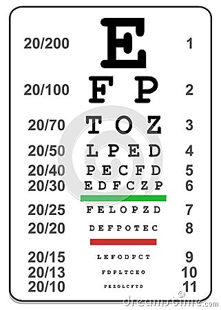
This is an example of a traditional eye test which are known as snellen charts.


http://thumbs.dreamstime.com/thumblarge_514/1277169481IqCKR1.jpg

This is similar to the one above apart from it is a bit more detailed.


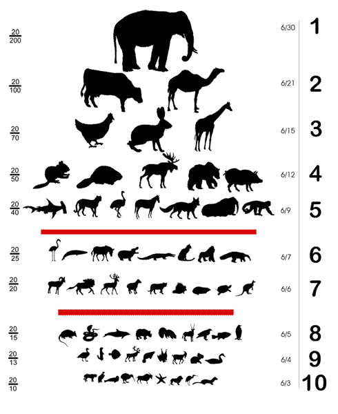
http://www.semiquestion.com/shirts/designs/600x600/animal-eye-chart.gif

This is an example of the sort of thing I am required to do. The designer has used animals as their object using simple vector illustrations. Even when they get smaller it is still clear what they are.


http://llwproductions.files.wordpress.com/2012/04/funny-picture-5-doggie-eye-chart.jpg?w=680

This is again another example of using objects for an eye test. I will only be using one object rather than a series which in a way makes it simpler for me. I will just have to find a way of communicating a Rubix Cube without all of its colours because of the restrictions of the brief. The only thing I see wrong with this eye chart is that I cant see the smallest row.


http://photos.imageevent.com/motorbiker/newspics4/Utah-Highway-Safety-Eye-Chart.jpg

This is a good example because the same/ similar object has been used throughout the whole eye chart, which does mean that it makes it easier for the target audience to see what the object is because they have seen it at a larger scale. Another thing that I have noticed about this chart is the format, it has been laid out differently to the one above, which means this gives me another aspect to think about when creating my Rubix Cube eye chart.


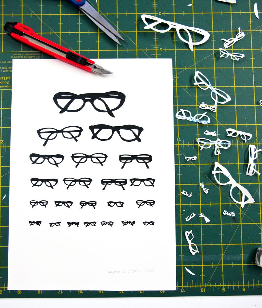
http://skinnylaminx.com/wp-content/uploads/2012/04/glasses.jpg

I really like this eye chart because it has been done using a hand rendered method of paper crafting. It makes it different from just using a computer. I also think it works well because they have used near enough the same pair of glasses, so it communicates well.


http://blog.dwr.com/.a/6a00d8345173e769e20147e17bbee0970b-450wi

One thing that I think works really well about this how they used just black for the chairs but used tonal values to make it easier to understand. The problem that I see with this chart is that there is lots going on which becomes a bit confusing as the pictures get smaller, as there are several different types of chair.


http://www.moderncat.net/wp-content/uploads/2012/03/CatEyeChart.jpg

This chart is a little complex and confusing as theres a lot going on but the imagery is very clear and understandable. They have kept a visual consitency and repeated the imagery in a different order on each line of the eye chart.

Wednesday 11 April 2012

Image Brief Two// Type as image..

For the second studio brief for Image we had to create 3 A1 quotes using type as image. I have been looking at some examples of type as image. Type as image can be interpreted in a couple of ways. The type can make the image or the type is combined with image. Below are a few examples of both. I think that type as image is using type in an unconventional and traditional way, you are bending the rules of typography.


http://www.designcrash.com/wp-content/uploads/2009/05/white_hand_type_by_drybones90.jpg

This example is really simple, they have used the words of the body parts to make the body parts. This is an example of type as image where the type makes the image.


http://c0170361.cdn.cloudfiles.rackspacecloud.com/205473_83095_8591d6fe1f_p.jpg

I really like this piece as it uses the shapes of the sky through buildings to create letters. Its very clever and effective. This is an example of how an image makes the type.


http://30.media.tumblr.com/tumblr_kshzbdJ0VA1qz50oeo1_500.jpg

This is a really cool piece of design. The designer has used cubes to create the word cube. This form of type as image is quite literal, using the 'physical object' of the word to create the word. It creates a direct link.


http://cdnimg.visualizeus.com/thumbs/69/b8/type,graphic,design,inspiration,letter,typography-69b8dffb1b4603faa50ee6ed4a91bc36_h.jpg

This piece of type as image doesnt use the same technique as the others. The imagery combined into the type has no immediate relevance to the type, it is being used only for decorative purposes.


http://reineke.files.wordpress.com/2009/06/ishottheserif-tomgabor.jpg?w=420

Sometimes type as image can be used to illustrate a quote or caption. This is a really simple but clever example of this, playing on words of Bob Marleys song 'I shot the sherif'.


http://simoncpage.co.uk/blog/wp-content/uploads/2009/02/typography-is-everything-9a-634x396.jpg

This is an other example where the image is visually representing the word. The type isnt very clear but you can make out what says and the fact that the imagery is representing the word helps the target audience understand the design.


I really like this design, it is using candy to illustrate the caption. Its very colourful and I like the fact that it has been hand crafted and photographed rather than using digital media.


http://behance.vo.llnwd.net/profiles/70775/projects/83203/707751246616752.jpg

I thought this was a really nice piece of design. The letter 'o' has been illustrated using a floral pattern. This is an example of type as image where the type is no longer conventional, it is a piece of imagery.


http://imgs.abduzeedo.com/files/paul0v2/typography-mania/69/tm-05.jpg

I am not entirely sure what this type says but I really like how the designer has used imagery to communicate the type. Its really simple but effective.


http://www.mygeekpal.com/wp-content/uploads/2009/06/milk-typography.jpg

This is probably my favourite piece of type as image of the ones that I have documented because it is so simple but really works. Its very clever even though it is simple. You can read the word but still appreciate the imagery that forms it.


http://webdesignledger.com/wp-content/uploads/2009/09/typography_art_28.jpg

This type as image is for something relating to the movies as the type is made up of a continuous role of film. Its very well composed and original.


http://mameara.com/wp-content/uploads/2010/12/typography-09.jpg

I love how you know that the smashed object is a light bulb combined with the word 'eureka'.


http://behance.vo.llnwd.net/profiles/53318/projects/92669/533181210951125.jpg

This is clever how it illustrates what it is saying by having the inked words leak where water has been put on them.


Image Brief One// Editorial Design..

The first brief of the Image module was to design 3 images for 3 different articles. The images had to relate to the context of article and the tone of voice. I have been looking at editorial design that I feel fits the articles context.


https://blogger.googleusercontent.com/img/b/R29vZ2xl/AVvXsEhtBkq78hqoz5-0UM2Jrw2I-nOv3cZrH_ZZGG037eUFIhxtX4ME-93MGcpwQ2wEjUQqgHNjfFNYrcktGH0ONRTT_Kt_YDb937TnAWgo-9TGozSNDCBXR_eyuPKzh1s9XJ3gLxn4k9RWcq4/s1600/atlanta+business.jpg

I think that the photographic and illustrative methods used for the imagery in this article work well. It makes it more engaging and more interesting to look at, whether or not the article is dull or interesting.


http://imgs.abduzeedo.com/files/paul0v2/editorial-design/ed-05.jpg

Again this uses a balanced use of photography and illustration. There is more imagery on this article which I think is more appealing to read. When you have too much text sometimes it puts you off reading something. It is also very important to have imagery with an article that relates to it or even tells you what the article is about but using images. This will help the reader understand the article more and also help them to decide if they even want to read it.


http://www.matiekiller.com/files/7612/7190/8663/ceopay1.jpg

The text and imagery for this article are quite separate from one another, you can see they relate due to the title of the article and the imagery used in context.


http://gavfeeney2010.files.wordpress.com/2010/11/nd-editorial-1.jpg

All of these examples work really well, the imagery used reflects exactly and literally what the articles are about which makes it easier for the target audience to understand and enagage with.


http://behance.vo.llnwd.net/profiles18/342595/projects/1067275/b13ed387c1bd1e50852c04b14892c4b4.jpg

I think the balance between imagery and text across the two pages works really well. The face that is split in half leads you across to the next page. This means that both imagery and text is as important as the other.


http://behance.vo.llnwd.net/profiles2/133822/projects/353527/1338221258995829.jpg

This piece of editorial works well because of the relating images. The article is about retro fashion and that is what the images show. I think it is important to carefully think about what imagery to use with an article because sometimes editorial designers try to be clever with their images and not relate them in literal way to the articles context which can cause confusion or just look crap.


http://artspacetokyo.com/images/ast_2/blog/image_uploads/guardian_article.jpg

This is an article from the Guardian, I think the Guardian take a good approach with the images they use as they have a balanced combination of photography and illustration. Their articles also all have a similar layout to them and the imagery seems to have an overall tone of voice to them.


https://blogger.googleusercontent.com/img/b/R29vZ2xl/AVvXsEg8N0mjS_UB3TqIORESUhgAf91e0Bvsd57bJpXgcjEBnuXDYop7M2sLLFuI2TFfCIYwEIVZezwuSmuN7tvpbyR382cVm2iJf7h05zhSdisXJo9HuQrzaJC7CHLkvKZzieOvL60SPeJqWQts/s1600/GUARDIAN+ARTICLE.jpg

This article is also from the Guardian, I think this one works well because of the way it has been laid out and also how the two articles relate to one another.