Task:
Based on the terminology and examples introduced during this session, extend your awareness of the diversity of print production methods in relation to professional design practices discussed. See how this impacts on what you have learnt so far and how it might affect your personal interpretation of print issues around the 4 core areas below.
- Branding and Identity
- Packaging and Promotion
- Publishing & Editorial
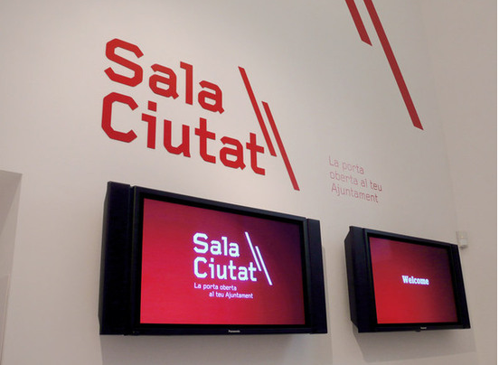
- Information & Wayfinding
LOOK AT:
How the Pantone Matching System (PMS) works.
What exciting alternatives different stock/substrates can provide in terms of options.
How you might collaborate/interact with specialists
How the same problem might be solved in different ways.
How the Pantone Matching System (PMS) works.
What exciting alternatives different stock/substrates can provide in terms of options.
How you might collaborate/interact with specialists
How the same problem might be solved in different ways.
----------------
As a designer it is important to understand about print and how it can not only effect the way our designs look but it can also effect its message. We dont necessarilly need to know the ins and outs of a printer and all that jazz, but it is priceless to know about print finishings, formats, and stock, basically all of the things that will effect our designs. Printers tend to hate Graphic Designers because we are normally clueless when it comes to print.
I have previously looked at other print methods and how they are used within particular areas of Graphic Design, now I am going to look at specialist printing and how we can use different methods of producing a similar outcome.
---------------
All of these four areas use print as part of their practise, they have to think about how they will print their designs, how much it will cost, and what will be the best way of printing to help communicate thier message. After learning a lot of new things about print I can now understand and appreciate how things are done and how skillfull a printer really is. Its not just about laser printers and gloss or matte stock. Print is a whole new world and there are so many things you need to consider when designing for print!
There will be the obvious like stock, colour, format and costing, but there is so much more to it. What about spot colouring, metallics, foiling, embossing, debossing, spot varnish, flocking, print process, diecutting..the list goes on. As a designer we have to be knowledgable enough in terms of print to know what all of these things are and how they will effect our final piece of communication. You could have a good design that communicates everything you needed it to, but if you use an unsuitable printing method or finish, it could change the whole message of what you are trying to communicate. It is about finding a perfect balance between what you are trying to communicate and how you will print it. If you can understand print you will be on a winner!
---------------
Branding and Identity:

-------------

--------

------------

-------------

------------
Packaging and Promotion:

------------
Publishing and Editorial:

-----------