Thursday 29 September 2011

Design production for print: Study task 2/colour for print..

Task: Using examples of design for branding and identity, packaging and promotion, information and wayfinding and publishing and editorial explore the following colour systems:

- CMYK (process)
- Spot colour (2 or more)
- Monochrome and tints (solid colour and half tones)

-------------


Branding and Identity:


This is a piece of brand identity that I found on the Behance website. The design uses monchrome colours for print. The logo itself has a slight tint in the centre, its subtlety just gives it a sparkle which makes it so much more interesting than one colour.


This is part of a series of photographic prints for a spa. The use of monochrome adds sophistication and compliments the brands identity and personalitity. The image used is very surrene and the colour process enhances this.


The above image is self promotion print for a Magician, he has used photographs within his branding which would use a CMYK colour process for printing. There are a few things that he has printed onto such as key rings, posters and cd's, these would each use a different printing process. I think that using CMYK with this particular branding works really well because his photos are very mystifying and it would not have the same attraction in my opinion, if it were monochrome for example. Monochrome is a colour process which I think works well to add sophistication to a brand as it helps to keep things simple.


I really love this front cover of the Arts Project magazine (which is an actually an issue about print!). They have used pieces of print that use various colour processes to create the word PRINT for the front cover. The magazine itself is then printed using a CMYK colour process because the image has been made of using print that uses CMYK (if that makes sense).


These business cards use spot colouring as their colour process, the flash of colour shoots through the company name. This draws your eyes in, the colouring uses a slight gradient which softens the colouring but keeps it bold enough to stand out.


This is a really creative way of designing a business card, rather than a standard bit of card. This opens up to reveal the information on the inside. They use two colours for this design which I think is spot colouring, they also reverse out the colours on the inside to outside. I think if they had kept the colouring on the inside the same as the outside, it would have been less legible, but because the blue is a light shade the brown stands out. On the front the blue works really well as the text colour, it keeps it very delicate and sophisticated and its not too 'in your face'.


--------------

Information and Wayfinding


I found this image of a Pantone calendar on the Behance website. They have used the CMYK colour process as the image used in the centre is made up of coloured photographs. Pantone colours are actually solid spot colours so its quite funny how they have had to use CMYK for printing their calender.


The Argos catalogue is full of information and is printed in CMYK, they use thousands of coloured images within their catalogues. Also becasue they are printed in such large quantities they are probably printed using a cheap and quick process.


These printed information pieces use black monotone, using monotones and duotones adds sophistication to a piece of print. Although this may just be my personal opinion, black and white is just nice and simple but if done in the right way it looks so good.


This piece of print uses a pop up style design, it is a monochrome design as it only uses the grey type within it. The white is obviously the colour of the stock. Designs like this are very cheap to print as monochrome is one colour using tints and tones.


This design uses spot colouring, spot colouring is when the colours used arent made from the CMYK colour process. The spot colours in this design have been used as colour coding for a key.


These designs look as though they have used spot colouring, it would be hard to tell exactly without using a linen tester. They have used 4 colours plus stock, some of these have been flooded as you obviously cannot print white. There is a nice visual consistency between all of the designs, they had probably created a specific swatch library with the four colours they have used so that they have an exact visual consistency.


-----------------

Publishing and Editorial


This design has used monotone and duotone. The duotone image is the yellow part, they have combined yellow and black tonal values. I think it works well by using both rather than one or the other, just more visually interesting.


This design just uses a blue monotone. The blue they have used is the same as their logo so there is a visual consistency. Sometimes it can be hard to tell if they have used black too because one colour does have a lot of tints.


This design has used the CMYK colour process. This is probably the case because the magazine has used a full cover photograph.


This publication has also used the four colour process, they have used colour overlaying to make other colours, which lowers print costings. If this design were to use just spot colours, the printing costs would be expensive. Overlaying and using tints of one colour can keep costs down without restricting colour usage within a design.


This design uses the monochrome process, using tints of black to create the image. Monochrome doesnt just use black, it can be any single one colour and its tints, as long as the design only uses one colour. You have to be careful when using monochrome in design as it can either make or break a piece of design, but I guess thats with any colouring.


This design also uses monochrome, using just black and its tints. This design uses it slightly differently to the one above, the black has been kept as a solid colour and has been used to fill in shapes which make them dominant against the rest of the design. Again using just black would keep printing costs down. With this design using it so creatively too means that its cheap and effective, every designers dream.


-----------------

Packaging and Promotion


These designs use two specific colours. They would both be spot colours that are specific to the brand. Many companies/ brands do this with their logo so that no matter where they send work to be printed their logo will be consistent in colour throughout their branding/ range and merchandise.


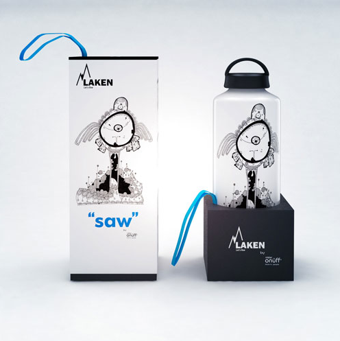
This packaging uses to spot colours, the blue and the greyish/ black. The illustration uses tints of the solid spot colour to allow some variation. It works well with the blue because it stands out from the dark grey.


These packaging designs use just black within their packaging designs. The range of make up is for Topshop which is a very popular high street fashion brand. I think that they have chosen to keep their packaging simple because their clothing can be very flamboyant. The design definetly reflects on their branding.


This is a CD case for a music album, they have used monochrome, they have distorted a photograph with shapes. The colour they have used looks like a dark brown. Using the brown works well with the style of the design as its not as harsh as black.


This wine bottle packaging uses the CMYK four colour process. The colours are very washed out and toned down, this works well with the image that has been used. It is very surrene and subtle like nature. Colours set a tone and atmosphere, if this same image was created using very bright colours it wouldnt give the same tone of voice and it could even possibly change the target audience.


This 'scratch card' style design also uses the CMYK colour process. I can tell this because there has been a large number of different colours used. I think its really cool how the design used the thin layer of latex, therefore the top must be scratched off to see the underlying colours.


At the printers: Seminar 1..

Tuesday 27th Sep' Print seminar with Lorenzo//

- Commercial print processes are: /practical, /economical, /technical
- four main commericial printing processes are:

- Rotary printing
- Digital printing
- Screen printing
- Pad printing

Rotary printing:

A process which involves image printing plates that are based around a cylinder. This process is an automated one which means the material to be printed on can be fed through or on a roll.


- There are 3 types of rotary printing:

- Offset lithography: Etched aliminium plates that are wrapped around a cylinder, which then transfers ink to a rubber offset blanket roller before then printing onto the surface chosen. This process is vey fast and can also be known as DTP (direct to plate).

Web offset is another type of lithoprinting, it is often used for producing large amounts of print for example newspaper printing. They use a big roll of printing material. They are very fast and often have finishing and folding built into them.


- Rotogravure: This process uses copper plates which transfer ink directly to the print surface, usually on rolls. These are often long running printers due to the durability of the plates.

The gravure process would be used for things like printed laminate flooring and glossy magazines, gravure is very good quality.


- Flexography: A positive mirror image is made of a rubber plate which is then placed around a cylinder which then transfers sticky ink to the print surface, this is usually done using roll feed.

Flexi is often used for things like sweet wrappers and packaging, its not brilliant quality because its cheaper than other processes. Companies always look for best value printing and what your printing and its purpose will decide on what printing process would be most appropriate.


Key words:

- Planographic (litho)
- Intagio (gravure)
- Relif (flexo)

Another type of print that is commonly used is digital print. Digital print is the reproduction of images by translating the digital code direct from a computer to a material without an intermediate pyhsical process.

- Rip (raster image processor): This is something that takes the code of the digital design and sorts the file ready for print.

Digital print is often used for short runs as it can be quite pricey, the materials you can print on using the digital process ranges from paper to metal.


- Screen printing: A printmaking technique that uses a woven mesh to support an ink blocking stencil. Screen printing can either involve a rotary screen press which is mechanical or people could operate it.


- Pad printing: This is a printing process where you can print a 2D image onto a 3D object. Things you could print on include pens, usb sticks, cups, golfballs etc.

Thursday 22 September 2011

What is Design for print? Studio brief 1..

Brief:

Produce a 'Top ten' manual of things to know, consider or remember in order to produce successful design for print. You should use the seminars and tasks from the modules as a starting point for your own individual/ independent investigation of the methods, processes and formats that can be used to create innovative but practical solutions to print based design briefs and all aspects of print based delivery.


--------------

As a starting point I have thought about the things that I think are important when it comes to printing. As I have not yet been to any seminars about print, this list is only from common sense and basic knowledge.

- Stock:

 You need to know what your going to print onto, paper (if so what sort,  ISO etc), metal, card, wood...

- Type of printer you need to use:

This could be from ink jet printers, laser printers etc

- The costing and your budget:

You will need to know your budget and the costings of what you are going to print, whether its 10 things your taking to print or 10,000

- Pantone:

I think Pantone is really important when it comes to sending things to print, it allows you to be specific on exactly what you want. Pantone is a globally recognised colour system, so that blue you have on your screen is the blue that will be printed if you sent off print to China

- Time:

First thing to do when it comes to printing is to know how long it is going to take. If your designing something for a client to go to print and they have given you 4 weeks, 2 of those weeks maybe how much time the printers need to deliver your designs, which leaves you 2 weeks to design! Timing is everything

---------------

Types of printers:

- Toner based printers
- Liquid inkjet printers
- Solid ink printers
- Dye- sublimation printers
- Ink less printers
- Thermos printers
- UV printers
- Dot matrix printers
- Line printers
- Pen based plotter printer
- Daisy wheel printers

Types of ink:


What is Design for print? Study task 1..

Task:

Find at least 5 diverse examples of the effective/ creative use of print in the following areas of design:

- Branding and Identity
- Packaging and Promotion
- Publishing and Editorial
- Information and Way finding

You should aim to identify design work from a range of commercial/ cultural references, target audiences and creative contexts.

------------------

Branding and Identity:


Before starting to look online for creative printing I looked through my stuff to try and find examples of print that are not just on paper. I looked in my purse and chose these particular cards. They would have been printed onto with a printer and using a particular printing process. They fall under branding and identity as each one belongs to a company, I guess in a way its like their business card/ loyalty card. I think that sometimes we take for granted design and print like this. It wasn't until I was given this brief that I realised how many different materials and things could be printed onto and using so many different techniques.


Another thing that I hadn't thought about before was printing onto cd and dvd discs. When large numbers are being printed onto there obviously has to be some kind commercial printing process to be able to mass produce print. I think printing like this is creative because its print onto a media that is not as obvious as paper based printing.


I looked at my stash of alcohol to see if any of them had their branding printed straight onto the bottle, as printing on glass was another printing process, but they all had printed stickers/labels stuck onto them. Some bottles though had printed lids, which were metal. I figured that printing on metal with such an awkward shape was not just creative but also clever. It would be interesting to actually go to a factory that does printing like that to see how they mass produce and print.


I found this image on Google, I think its a really exciting way of branding and promoting yourself. The billboard ad is for a food establishment and the way that it has been made is so the cars read it as they drive and then get 'eaten' by the ad. I think whats good about it in terms of print is the scale of it, the materials used also have to be quite durable to be in its location and obviously weather proof. Another thing that would be really interesting to find out about is different inks used in large scale printing like this and also how they can even print things at this scale.


These are old milk bottles that have their branding printed straight onto the glass. Im not sure how they would of printed this when mass producing. I think its creative though because they would of had to find  a new way of printing onto glass and similar materials.


Stamps are another thing that I think we take for granted. There are so many varieties of stamps, often the 1st class stamps have metallic ink (going back to looking at inks for mass production printing). They come in different sizes too. I would say that they would have to have been printed with a good quality printer to be able to catch the fine details of their designs, they also represent the Queen so they have to be done properly.


I think this is a really cool piece of print. These are the standing handles for people on buses. But they have had a watch companies branding printed onto them. So as you can see when someone puts their wrist through to hold on, they are wearing a watch. Just pure cleverness! 


This dog tags are business cards for a company, they have been printed onto actual metal. When I found these I thought it was obviously creative branding yourself in this way, as it would make you stand out from other companies, but at the same time I was thinking that it must have cost them a fortune to produce enough of these to hand out to clients!


This is a billboard advertising a brand of Ale. The thing that really stood out for me was how the print was specially made to fit into the crease of the building to look like a slice of cake. Again its also fascinating how print can be produced at such a large scale.


Packaging and Promotion:


Packaging and promotion can be a bit obvious. To start with I looked at stuff in my room to see what materials could be printed on. Perfume bottles made of glass often had print on them and also their packaging. Something I found was that each packaging had a different stock, some were matt and others shiny gloss, but they had been printed onto. Is there particular print processes or inks that have to be used to do this? 


Metal cans were something else that I had loads of that have been printed onto, I m guessing these would have to use a different ink and process to card for example. It would be interesting to also find out if they print onto one large piece of metal and then cut and shape? Things like this and the image above are obviously printed for mass production and each have a specific target audience in relation to the actual product and advertising.


Thin plastic wrapping is another thing that is printed and is everywhere, toilet paper wrapping is a good example. I guess that because it is so commonly done, that we dont think that it is that exciting or creative. But at some point someone had to sit there and think how on earth do we print on this!


Cans again is another example of printing onto different materials.


I think this is a good example of important links between the printing method and the target audience. These are children's tissues that have characters printed onto them. Now because tissue is such a delicate material, there again must be a print method that can print perfectly onto fine materials, also because they are for children with runny noses, there must be a particular type of ink that has to be used. To be able to find a way of printing onto tissues like this would automatically make this brand more appealing to children, just because they have been creative in the way they have designed their product and found that way to print onto something so delicate. Genius.


Another example like the one above is children's plasters with printed characters on them, the packaging for the plasters is also printed onto tin.


Banana printing is very creative, although if im being honest with myself I really doubt that these banana skins were put through a printer, but its still pretty cool!


Publishing and Editorial:


I dont know why but I found this one more difficult to research, but I think thats because I didnt quite understand what I was looking for. What I have done is looked at some books I own as examples, books are obviously printed and fall under publishing and editorial. Some pieces of editorial design and publishing can be printed onto different stocks etc 


This a photo of printing information in two graphics books I own.


Again more info on printing which will come in handy! 


I really like the variety in colour and stock within these publications, some pages are pre coloured and others have been printed in full colour. I also like the layout of the bottom right hand design, its very simple but there is a lot of detail on the left hand page.


Information and Way finding:


Maps are a good example of printing for way finding. This is a poster of a map of Ocho Rios in Jamaica where I went on holiday as a kid. Its more like a creative map than a helpful map, theres loads of mini adverts all over it. Also its more like a poster than a map.


Examples of printed media that is part of our everyday life. Things like bank booklets and packs are printed onto good quality stock, their print methods reflect on their personality and how they want to be seen by their customers. Another thing is passports, these are very important documents with all sorts of bits and bobs that make it complete. Theres things like holographic prints to show they are genuine, the picture page is printed onto really thin plastic and the other pages are delicate and high quality stock.


These foot prints are so cute, they obviously fall into way finding. These are floor prints/ stickers, a lot of shops use these to advertise things or just direct people to places. Its a different way to communicate a message and is very creative.


I love this! Its just funny, McDonalds are using bus stops combined with way finding to advertise where the next restaurant is. I really love simple design like this, its just clever!


Im not sure how they have printed this one, or what it is made of. It is a billboard warning/ giving information about tail gating. The billboard is folding in to show a crash due to tail gating. Bill boards are printed media and this is a creative way of delivering a message to a large driving audience.


Another example of a pocket map, this would require ink that wouldn't wear down too easily as it would be opened and closed a lot by its user.