Thursday 27 October 2011

Design for print// Billboard research..


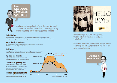
As part of my research and ideas for the design for print// Good is.. brief, I am going to propose some billboard designs to promote polka dots at a large fashion event. I am going to look at what they are and how they are used and what effect they have on communication and advertising.
---------------

'A billboard (also called a "hoarding" in the UK and many other parts of the world) is a large outdoor advertising structure (a billing board), typically found in high traffic areas such as alongside busy roads. Billboards present large advertisements to passing pedestrians and drivers. Typically showing large, ostensibly witty slogans, and distinctive visuals, billboards are highly visible in the top designated market areas. Bulletins are the largest, most impactful standard-size billboards. Located primarily on major highways, expressways or principal arterials, they command high-density consumer exposure (mostly to vehicular traffic). Bulletins afford greatest visibility due not only to their size, but because they allow creative "customizing" through extensions and embellishments.
Posters are the other common form of billboard advertising, located chiefly in commercial and industrial areas on primary and secondary arterial roads. Posters are a smaller format than bulletins and are viewed principally by residents and commuter traffic, with some pedestrian exposure.' Wikipedia


These are the standard billboard sizes dependant on how many sheets are used.

-------------


The images above show the costing and size of the billboards available by this particular company. It gives me a rough estimate of how much billboard advertising would cost.


This website came in very handy! Its a company that sells billboards and allows you to pick the location and size of your billboard to meet your specific requirements. This is really useful because it means you can choose an area where you know your advertisement will be seen by your target audience. For example if I was to create one based upon polka dots in contemporary fashion I could have it placed in a town centre where the main shopping area is. Meaning that those who are buying clothes in the city centre may likely to be interested in fashion and would see my billboard, which they could then relate to.

--------------

Billboards gallore..


Design for print// Top 10 Manual..

The Brief

Produce a ‘Top Ten’ manual of things to know, consider or remember in order to produce successful Design for Print. You should use the seminars and tasks from the module as a starting point for your own individual/independent investigation of the methods, processes and formats that can be used to create innovative but practical solutions to print based design briefs and all aspects of print- based delivery.

You are required to document your research and visual material on your Design Context blog. For submission for assessment you will also be required to select, summarise and evaluate appropriate source material as a multi-page pdf. document that shows your understanding of print processes, conventions and creative options from the perspective of a graphic designer. It should also demonstrates your ability to effectively organise and present a body information in a designed format. This document should be uploaded to your Design context blog via 'Issuu'. See additional briefings for further information.

Tuesday 25 October 2011

Design for print// Colour..

Colour is a very important aspect of design and it is important to understand the different colour systems and what they are used for. The two main colour systems are CMYK and RGB, each used for completely different things.

--------------

CMYK//

CMYK stands for Cyan, Magenta, Yellow and Key. These make up the four colour process which is used for print design. These four colours are able to make any colour within its gamut, suitable for print.


'The CMYK color model (process color, four color) is a subtractive color model, used in color printing, and is also used to describe the printing process itself. CMYK refers to the four inks used in some color printing: cyan, magenta, yellow, and key (black). Though it varies by print house, press operator, press manufacturer and press run, ink is typically applied in the order of the abbreviation.

The "K" in CMYK stands for key since in four-color printing cyan, magenta, and yellow printing plates are carefully keyed or aligned with the key of the black key plate. Some sources suggest that the "K" in CMYK comes from the last letter in "black" and was chosen because B already means blue.However, this explanation, though plausible and useful as a mnemonic, is incorrect.

The CMYK model works by partially or entirely masking colors on a lighter, usually white, background. The ink reduces the light that would otherwise be reflected. Such a model is called subtractive because inks "subtract" brightness from white.'


------------


------------

RGB//

RGB is the colour system used for screen only. RGB stands for Red, Green and Blue. RGB is used for screen based design only, it can produce more colours from the visual spectrum than CMYK, this is why it is so important to understand the difference between the two.


'The RGB color model is an additive color model in which red, green, and blue light is added together in various ways to reproduce a broad array of colors. The name of the model comes from the initials of the three additive primary colors, red, green, and blue.

The main purpose of the RGB color model is for the sensing, representation, and display of images in electronic systems, such as televisions and computers, though it has also been used in conventional photography. Before the electronic age, the RGB color model already had a solid theory behind it, based in human perception of colors.'


-------------

The colour gamut//


This colour gamut shows the colour range of CMYK and RGB. There are some CMYK colours that can be printed but cannot be produced in the RGB model, and there are RGB colours that cannot be produced in CMYK for print. As you can see from the colour gamut there are many colours that are out of the CMYK and RGB colour models. These colours cannot be reprodued for screen or print, we only have the pleasure of seeing these colours as they are.


This image represents how important it is to understand the two colour models. This shows how an RGB colour converts to a CMYK colour when printed. As you can see the RGB colours are a lot brighter and vibrant compared to the CMYK colours. If you were to try and print a design when it had been set as RGB on screen, you would recieve the equivalent through the printer in CMYK which would be very dull and nothing like on screen.


Design for print// Paper sizes and weight..

Paper sizes//

The most recognised paper sizes used are A, B and C sizes, they are what we use in the UK and everywhere else in the world except the USA. Below are images of paper size charts and how the sizes work. A size is the size that is most commonly used and heard of. B sizes are slightly larger than A and C is mainly used for the measurements of envelopes.


-------

Paper weight//

The weight of paper is called the 'GSM', this stands for grams square meter. The weight of a paper is based on how much it weighs in grams per 1 square meter. The higher the GSM, the thicker the paper.

'GSM stands for ‘Grams per Square Metre’, It’s a measurement of paper quality which allows for printers to be far more precise than they could be with wooly terms like ‘thick’, ‘thin’ and ‘kinda in the middle’. As the name suggests, it tells you how much a square metre of the paper or card you’re using would weigh (in grams, believe it or not). Although everyone tends to think in terms of thickness, with premium print being on thicker paper, it’s a good means of standardising the business and making sure that customers know what they’re getting.

We know that it’s not easy to visualise a square metre of paper (although it’s pretty fun: give it a go). So here’s a basic layman’s translation of some of the most common paperweights.

350GSM – This is what you might expect a reasonable quality business card to be printed on (or a Pulse Print flyer!).

180 to 250 GSM – Like a mid-market magazine cover.

130 to 170 GSM – A good quality promotional poster. Something that you’d expect to last a couple of months in most conditions.

90GSM – Mid-Market magazine inner pages

35 to 55 GSM – Most newspapers

Less than 35 GSM – If someone’s trying to sell you this as anything other than rice paper, you want to be reporting them for attempted theft.'

Design for print// Pantone..


What is Pantone?//


Pantone is a globally recognised colour reference system. Pantone swatches are a series of colours that each have their own unique colour code. This means that designers and printers around the world will all understand the Pantone system and can send their work almost anywhere in the world to be printed.

'The Pantone Color Matching System is largely a standardized color reproduction system. By standardizing the colors, different manufacturers in different locations can all refer to the Pantone system to make sure colors match without direct contact with one another.' // Wikipedia


These are some examples of the Pantone Swatch books, each book can cost around £300- £400 and a small set of books can cost around £1200. There are several types of books as there are different types of colour swatches. Metallic, coated, uncoated etc, again these all have a different unique code and come together in seperate books.


Design for print// Packaging and Promotion research..


As part of my research for the Good is brief, I wanted to design some form of packaging that would contain an item that my target audience could take away with them in the designed packaging. The packaging needs to be relevant to polka dots. I think that it would be interesting to see if I could make a polka dot shaped bag as it would fit in perfectly with my chosen genre.

This piece of design is very sleek and sophisticaed they have used diecutting and foil blocking for the front cover which has coloured design underneath. This could be interesting with a polka dot pattern used in a similar way to this, by having the polka dot pattern diecut and foil blocked.
-------


These designs are labelling for clothing. I think I was drawn to these designs because of the use of circular shapes and the black and white colour palette. The design is very simple and sophisticated. I also like how they have have used the 'q' in replacement for 'ck'. Clever.


These designs use a black and white theme and they also use circles within their packaging. I was inspired by thier use of simple packaging design that makes it very sleek. Their product is coloured which works really well against the black and white designs.


With these designs I liked how the bigger the bag got the less of the brand name that was visible, they played on scale and how they could interpret it.


This packaging is a good example of how I am wanting my packaging designs to look like. They are very simple and the logo is also similar to one I have designed for my brand. I want my packaging to be a circular shape though so that it fits with my theme more. Its interesting to see how they have scaled down the logo depending on what format it takes.


These are really clever designs, its almost like whilst the bag is closed and holding the contents it is happy, but when it is opened it becomes angry because it has lost its contents. It makes it more interactive for the audience.


I really liked the simplicity of this design, it is purely the one let on a white bag. I do think that with designs like this and in what I am wanting to design, is that less is more.


These designs are very sophisticated as they use foil blocking on the logo. Also the bottom packaging is circular and looks really cool. It looks very high end in terms of where you would recieve this bag, it reminds me of something like Harvey Nichols.


Design for print// Branding and Identity research..


I really loved this designers business cards, they are very sophisticated and sleek. I think I was drawn to them because of the use of a polka dotted pattern.


------