What is a title sequence?
A Title Sequence is the method by which cinematic films or television programs present their title, key production and cast members, or both, utilizing conceptual visuals and sound.
Source: Wikipedia.com
Here are some example of title sequences//
This sequence is very simple but it works well, it consists of type and simple shapes that move into frame in time with the music. There is really smooth transitions with the use of the rectangular shapes. They only use black and white which also adds simplicity. I think its good that they havent over complicated it and kept it as simple as possible, not only does it communicate well but it probably took them less time to make and still come out with high quality.
I really love the illustrations in this title sequence, its simple and fun. The small character is slightly animated which makes it more engaging. I think the thing that works best is the fact that it has a hand drawn feel to it and the imagery and design approach relates well to the film.
This title sequence for Spiderman is very interesting. They have used simple movements and depth of field to make you feel as though you are part of the web. The text is then placed onto the web as though it were flies, which then adds to the whole effect of spiders. I think that its clever in how they have looked at how spiders engage with their web in order to create a title sequence that not only has full relevance to the context of the film but is so simple and works so well. I think that the title sequences of films are quite important as they give you an initial indication of what the film is about and its sets a scene and an atmosphere which then runs you smoothly into the film itself.
The simplicity and the smooth transitions through frames works really well in this title sequence. The illustrations have been kept minimalistic, along with the colour palette. They use depth of field a lot which I find more engaging. The music also suites the motion but also the design approach. I think the more simple title sequence designs work more successfully than the complex ones, simply due to the fact that they are easy to understand and enagage in and they dont give away too much of the film, they just prepare you for the film/programme.
The Monsters Inc title sequence is brilliant. Its very engaging and fun and the music suites it well. The simple shapes and movements move to the beat of the music. Again it has been kept simple, the one aspect that I most enjoyed was the engagements made between the monsters and the doors and the fact that they have used a different design approach as to what they use in the film. It keeps the title sequence almost seperate from the actual film but they still work as a whole. The design approach has quite an old fashioned feel to it which is aided by the old jazz audio.
Really smooth transitions between frames. I particularly like the way in which the lines turn into type and then turn into something else. The illustrations are very simple and the colour palette aids this design approach by using quite neutral colours. The characters look as though they have been painted with a sponge because of their texture which stops the sequence from looking too dull and flat.
I think that the combination of video and motion graphics works really well in this James Bond title sequence, it makes it different from other sequences which tend to stick to one method of motion. One part which works well is the use of video with the static women. You can tell its video but it has an overlaid effect so it fits in better with the rest of the sequence. The type in this sequence doesnt seem to have much heirarchy, the images tell the story and the type is kept as simple as possible so not too distract from the illustrations. There is also good use of depth used in some frames which make you feel as though the object is coming out of the screen.
I think that the use of the dots and the way in which they change into new frames is very clever. It is such a simple way of approaching the sequence which works really well. Its very engaging and keeps you wanting to watch it. The colour palette is very simple and I also like the fact that they use simple illustrations and movements half way through the sequence which mixes it up a bit.
Friday 27 January 2012
Sunday 8 January 2012
Design for digital// Idents research..
What is an Ident?
Station identification (Ident or Channel ID) is the practice of radio or television stations or networks identifying themselves on air, typically by means of a call sign or brand name (sometimes known, particularly in the United States, as a "sounder" or "stinger", more generally as a station or network ID). This may be to satisfy requirements of licensing authorities, a form of branding or a combination of both. As such it is closely related to production logos used in television and cinema, alike.
Station identification used to be done regularly by an announcer at the halfway point during the presentation of a television program, or in between programs.
UK and Europe
Television
Broadcast stations in Europe do not identify by using a callsign, however most networks use a brand based on their common channel number. A form of station identification clip is played between programmes, traditionally incorporating the channel's logo, and accompanied by a continuity announcer who introduces the upcoming program (and promotes other programs). These idents evolved from mainly being mechanical models (such as the famous BBC globe), to becoming more advanced through the evolution of computer-generated imagery through the 1980s. From the 1960s to the 1990s, most broadcasters only used a single ident, sometimes using special variations for holidays and special events. In the present day, most broadcasters use a set of multiple idents built around a certain theme or branding element, often based on the channel's current overall look.
Source: Wikipedia
-----------
Here are some examples of TV Idents:
Channel 4 idents have always been really creative and clever. They play a lot with the arrangement of the number 4 across the sequence and there is also quite often a lot of depth with their ident designs. I also like how they seem so realistic, by combining the digital media with the use of real life footage and film.
BBC 1 and BBC 2 also create very memorable idents. BBC 2's idents simply use the letter 2 in many different environments. I think the ones that work well are the ones that use the number 2 almost like a window. So each time the 2 has its 'insides removed' something will be revealed. For example like when the tent door is undone and the beach is revealed. I also think that BBC 1's ident where the bikers are inside a spherical wall is really creative. Because they are using video thy can speed it up to effect the lighting, which is where they then add digital work which is the channel name and some shapes. It appears to b quite complicated to do but I think it is a lot easier than it looks. All it is, is the combination of edited video and possibly After Effects work.
These idents for BBC 2 are showing from the 90's till 2001. They are a lot simpler than what they are today because of the technology available to create digital idents. The older ones are really interesting even if they have been kept fairly simple. The first one shown in this video is a 3D number 2 with paint being thrown over it. The one after that is more digital based, with the number 2 waving into an arrangement. There is also a really cool one where they blow up the 2. There are so many different idents for BBC 2 and each one is very unique and quite quirky. They make them fun and very engaging.
This Cartoon Network ident is really fun. They use a series of arrows and patterns that lead you through the sequence and space. They then reach a finishing point by 'filling up' the C and N of Cartoon Network. It looks complicated but in actual fact its quite simple. I think the best bit about it is the amount of detail to begin with that then just turns into the logo. The patterns before hand are showing how much fun goes into Cartoon Network.
The BBC Three idents have changed a lot over the years. The slug idents were kept very simple and light hearted. Im not sure why they chose to create slugs for the ident characters but they work really well. the second ident on this video is one of the more up to date ones for the channel. They are completely digitised and show the world of BBC Three. Im not sure what software would have been used for this ident, it looks quite advanced.
This ident for MTV is really simple and would have been easily created on After Effects. They would have made the illustrations and then taken them into After Effects (possibly) to add motion. I think the colours work well as they are bright and with the combination of the colours and the characters, this ident is very engaging and fun!
Again these sets of MTV idents are very simple. I think that the idents that have been kept simple work best than the ones that are too complicated. Most idents dont last that long, so the last thing you want to be doing as the designer is not making your message clear enough in the time you have.
These idents for Nickelodeon are brilliant! They are so simple and so funny. The characters make it really engaging and it gets the message through within the short space of time.
I think this channel Five ident is a bit longer than some of the other ones that I have looked at. It is also more complex, they have used clips of the TV programmes they air and also digitised animation and motion graphics. As much as I prefer the simpler idents, this one is really exciting and one that you dont want to take your eyes off. There is so much going on but it is arranged in a way that flows well and gets to the point. The purpose of an ident is to give you a snippet of what the channel or a particular programme has to offer and what it is about. This ident does exactly that.
Design for digital// Story boarding..
What is storyboarding?
Storyboards are graphic organizers in the form of illustrations or images displayed in sequence for the purpose of pre-visualizing a motion picture, animation, motion graphic or interactive media sequence.
Source: Wikipedia
Storyboarding came about in the early 1930's when they were developed by Walt Disney. Since then they have become increasingly used as a tool to prepare a piece of animation/ motion graphics/ idents ect in post production ready to take to filming. It is a very important process which allows a designer to get all of their ideas onto paper before trying to create it digitally. This is very cost effective because it saves making mistakes on a digital format.
//Animatics
In animation and special effects work, the storyboarding stage may be followed by simplified mock-ups called "animatics" to give a better idea of how the scene will look and feel with motion and timing. At its simplest, an animatic is a series of still images edited together and displayed in sequence. More commonly, a rough dialogue and/or rough sound track is added to the sequence of still images (usually taken from a storyboard) to test whether the sound and images are working effectively together.
This allows the animators and directors to work out any screenplay, camera positioning, shot list and timing issues that may exist with the current storyboard. The storyboard and soundtrack are amended if necessary, and a new animatic may be created and reviewed with the director until the storyboard is perfected. Editing the film at the animatic stage can avoid animation of scenes that would be edited out of the film. Animation is usually an expensive process, so there should be a minimum of "deleted scenes" if the film is to be completed within budget.
Source: Wikipedia
------------

Some storyboards can be drawn very quickly and roughly so that the designer can get their ideas out quickly. They would also write short notes with most frames to explain what would be happening in them and what sort of camera shots would be used.

If a designer has a longer time period to produce a storyboard or maybe finalise a storyboard after reviewing it with the directors etc then they will spend time to draw out the storyboards more acurately with possibly more narrative.

Sometimes the storyboards can be drawn on large sheets of paper together and often they can also be done in seperate frames so that they can be moved about in the reviewing stages. This makes it easier for the designers and directors to change elements of the storyboard without having to re draw the whole thing.
------------

Here is an example of my own storyboarding for the Silent Movie brief. My storyboard is only 5 frames long on this example, it shows the main key frames of the sequence. I have also added notes about how fast the type will move within the time line and how it will transform.
Thursday 5 January 2012
Design for digital// Kinetic typography research..
What is Kinetic Typography?
Kinetic typography—the technical name for "moving text"—is an animation technique mixing motion and text to express ideas using video animation. This text is presented over time in a manner intended to convey or evoke a particular idea or emotion.
Source: Wikipedia
Production
Kinetic typography is often produced using standard animation programs, including Adobe Flash, Adobe After Effects, and Apple Motion. The effect is most often achieved by compositing layers of text such that either individual letters or words can be animated separately from the rest.
Source: Wikipedia
Here are a few examples of Kinetic Typography that I found on YouTube:
Kinetic typography is really fun to make but it also takes a lot of skills and good ideas to make it look great and communicate the message in which you intended. This means that you would have to carefully consider the typeface, the colours, the speed and size of the type within the timeline. Composition of words is very important in order to communicate the relevant meaning, you need to consider the scale of each letter and word within the motion so that it flows well and runs in time with the audio.
I think the most successful kinetic type motions are the ones that consider all of the above aspects. The pace, composition and typefaces are the most important aspects of making a piece of kinetic type. I think its amazing how you can use type to illustrate a feeling or emotion by the weight, typeface or point size of a word/ letter.
A piece of kinetic type doesnt nessecarily have to be really long for it to be successful. This 46 second motion is really engaging, the type moves in time to the audio which helps to it create the right atmosphere and communicate the message in the appropriate way.
Music is something else that can work really well within a piece of kinetic type if done well. I really enjoyed watching this piece of kinetic type, they incorporate simple illustration to help communicate particular words, which works really well.
Wednesday 4 January 2012
Design for digital// Top 10 research..
//Bucket Lists/ things to do before you die.
The brief:
Design and produce a title sequence and a set of 4 promotional idents/ stings for a proposed TV programme TOP 10/ WORST...or 10 THINGS YOU NEED TO KNOW ABOUT..
Your response should aim to clearly communicate the subject, concept, content and mood of the programme in a way that will engage an audience who have chosen to tune in. You should also aim to reflect the bramd identity of the channel that in your opinion- would run the programme.
You will need to choose a subject matter that you find interesting but also offers creative potential.
Your audience will be interested in your chosen subject matter to want to tune in. They will probably already have their own opinion regarding best/ worst. It is your task to engage them from the start.
-------
For my Top 10 I have decided to look at bucket lists and things to do before you die. The reason that I chose this subject was because it is something that I often think about. Everyone has dreams and ambitions so I think this could work well with the format that we have been asked to use. Motion graphics is very engaging if used well, and I think that if I could create an effective piece of motion graphics about bucket lists then it might potentially make people write one!
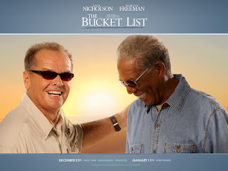
The idea sprang from my skydive that I did before I came to uni, I know that it is on a lot of official lists of things to do before you die. There is also a film called the bucket list which stars Morgan Freeman and Jack Nicholson.
Origin of the Bucket List// to kick the bucket:
To kick the bucket is an English idiom that is defined as 'to die'.
// Origin theories:
A common theory is the idiom comes from a method of execution such as hanging, or perhaps suicide, in the Middle ages. A noose tied around the neck while standing on a bucket, when the bucket is kicked away the victim is hanged. http://en.wikipedia.org/wiki/Kick_the_bucket
//Definition of Bucket List:
A bucket list is a person's list of things to do before they die/ kick the bucket.
The good thing about having a bucket list is that it can be personal and unique to everyone, it doesnt have to all be about doing crazy things like skydives and bungie jumping. Maybe theres a book you've been wanting to read or an old album you've wanted to listen to. Bucket lists help to motivate people and give them something to work towards and once you have ticked off something from your bucket list you will feel like you have achieved something which will motivate you to do something else.
----------
//Bucket List (2007)/ Director Rob Reiner, Writer Justin Zackham
Staring Morgan Freeman and Jack Nicholson
(Action, drama, comedy) The film is about two terminally ill cancer patients who escape their ward to head off on a road trip with a wish list of things to do before they die.
http://www.guardian.co.uk/lifeandstyle/2012/feb/01/top-five-regrets-of-the-dying
I found this article on the Guardian website about the top 5 regrets people have about their lives before they die. It doesnt have too much relevance to Bucket Lists but it didnt give me another view on what people regret when they are on their 'death bed'. Reading this article actually made me cry, it talks about how people wish they had let themselves be happier and wish they had been true to themselves rather than worrying what other people thought about them. I guess in a way it has motivated me in a way, to do well in this module and try my hardest, as there is nothing worse than having regrets. Its almost like a list of life lessons, saying that in life you have to make sure your happy and your doing things for you and being true to yourself, dont worry about what other people may think of you!
Skydiving:
Skydiving is one activity that has been appearing a lot throughout my research into bucket lists and things to do before you die. I did a skydive just before I came to uni and it was probably the best thing I have ever done! It is so scary but so amazing, one of the best feelings in the world. I just decided one day that I wanted to do one, so I booked it! It was very spontaneous and maybe slightly mad, my mum wouldnt talk to me about it and said that I had to make my own way there because she didnt want to be responsible for taking me if I died whilst skydiving! :D
Unfortunately I couldnt afford to have my skydive videoed but I found a really cool one on youtube! If this wouldnt want to make someone do a skydive then I dont know what will!


http://www.atravelaroundtheworld.com/


-------------------
On this video he gets a tattoo of the cancer ribbon for his friend who had cancer (at this time his friend was still alive). He also gets his friends first initial. I think that the fact this young Irish man is doing this for his ill friend makes it all the more inspirational.
He then does a skydive, which looks amazing. He is just a young guy living his life to the fullest. There are so many different things that he does. I do believe he does something new each week. There are other things he does such as streaking in public, zorbing, paragliding, bungee jumping and many more. His videos are all home made which makes it more personal to him, and there is always happy music playing. Which had helped me to decide on an audio for my moving image.
The brief:
Design and produce a title sequence and a set of 4 promotional idents/ stings for a proposed TV programme TOP 10/ WORST...or 10 THINGS YOU NEED TO KNOW ABOUT..
Your response should aim to clearly communicate the subject, concept, content and mood of the programme in a way that will engage an audience who have chosen to tune in. You should also aim to reflect the bramd identity of the channel that in your opinion- would run the programme.
You will need to choose a subject matter that you find interesting but also offers creative potential.
Your audience will be interested in your chosen subject matter to want to tune in. They will probably already have their own opinion regarding best/ worst. It is your task to engage them from the start.
-------
For my Top 10 I have decided to look at bucket lists and things to do before you die. The reason that I chose this subject was because it is something that I often think about. Everyone has dreams and ambitions so I think this could work well with the format that we have been asked to use. Motion graphics is very engaging if used well, and I think that if I could create an effective piece of motion graphics about bucket lists then it might potentially make people write one!
The idea sprang from my skydive that I did before I came to uni, I know that it is on a lot of official lists of things to do before you die. There is also a film called the bucket list which stars Morgan Freeman and Jack Nicholson.
Origin of the Bucket List// to kick the bucket:
To kick the bucket is an English idiom that is defined as 'to die'.
// Origin theories:
A common theory is the idiom comes from a method of execution such as hanging, or perhaps suicide, in the Middle ages. A noose tied around the neck while standing on a bucket, when the bucket is kicked away the victim is hanged. http://en.wikipedia.org/wiki/Kick_the_bucket
//Definition of Bucket List:
A bucket list is a person's list of things to do before they die/ kick the bucket.
The good thing about having a bucket list is that it can be personal and unique to everyone, it doesnt have to all be about doing crazy things like skydives and bungie jumping. Maybe theres a book you've been wanting to read or an old album you've wanted to listen to. Bucket lists help to motivate people and give them something to work towards and once you have ticked off something from your bucket list you will feel like you have achieved something which will motivate you to do something else.
----------
//Bucket List (2007)/ Director Rob Reiner, Writer Justin Zackham
Staring Morgan Freeman and Jack Nicholson
(Action, drama, comedy) The film is about two terminally ill cancer patients who escape their ward to head off on a road trip with a wish list of things to do before they die.

'We live and we die and the wheels on the bus go round and round'
---------
//Some Top 10 things to do before you die:
http://trifter.com/practical-travel/adventure-travel/10-most-incredible-things-to-do-before-you-die/
1// skydiving
2// dock with the international space station
3// edge of space supersonic jet ride
4// take a ride on a Russian mig-fighter jet
5// dive to the Titanic on board a submarine
6// climb the great pyramid of Egypt
7// visit the Great Wall of China
8// covert ops
9// go diving with sharks
10// take an African safari
1// make a pilgrimage
2// eat a meal good enough to be your last
3// climb your own Mount Ventoux
4// memorize a poem and pass it on
5// make an enemy for life
6// forgive someone
7// see for yourself that the Earth is round
8// take someone you love to the camera degli sposi
9// defi gravity
10// let someone have the chance you missed
1// set foot on each of the seven continents
2// cross a country on a bike
3// ride something bigger than a horse
4// live like a local for a month
5// visit a real 'blues' bar in Chicago
6// learn a new language
7// go heli-skiing
8// travel India by train
9// climb one of the worlds seven summits
10// dive with a whale shark
1// swim with dolphins
2// walk the Great Wall fo China
3// dive with sharks
4// run the Virgin London marathon
5// visit Petra in Jordan
6// see the Northern lights
7// go on an African safari
8// float in the dead sea
9//go white water rafting
10// visit the Amazon rainforest
--------------
I found this article on the Guardian website about the top 5 regrets people have about their lives before they die. It doesnt have too much relevance to Bucket Lists but it didnt give me another view on what people regret when they are on their 'death bed'. Reading this article actually made me cry, it talks about how people wish they had let themselves be happier and wish they had been true to themselves rather than worrying what other people thought about them. I guess in a way it has motivated me in a way, to do well in this module and try my hardest, as there is nothing worse than having regrets. Its almost like a list of life lessons, saying that in life you have to make sure your happy and your doing things for you and being true to yourself, dont worry about what other people may think of you!
---------------
Skydiving:
Skydiving is one activity that has been appearing a lot throughout my research into bucket lists and things to do before you die. I did a skydive just before I came to uni and it was probably the best thing I have ever done! It is so scary but so amazing, one of the best feelings in the world. I just decided one day that I wanted to do one, so I booked it! It was very spontaneous and maybe slightly mad, my mum wouldnt talk to me about it and said that I had to make my own way there because she didnt want to be responsible for taking me if I died whilst skydiving! :D
Unfortunately I couldnt afford to have my skydive videoed but I found a really cool one on youtube! If this wouldnt want to make someone do a skydive then I dont know what will!

Heres me after ive just landed with my instructor, as you can see I am VERY happy! Once you land you just want to do it again! Its almost like a dream its that amazing!

I even got a certificate as proof and a memory of an amazing experience!
Movie clip of the skydiving scene in the film The Bucket List.
---------------
Travelling:
Travelling is something that a lot of people dream of doing in their lives, whether it be visiting a few countries or travelling the world. Below are some links to websites about travellers stories and must see places when you go travelling.
------------------
Climbing a mountain:
'As of the end of the 2004 climbing season, 2,238 people had reached the summit (1,148 of them since 1998) and 186 people died while summitting. The conditions on the mountain are so difficult that most of the corpses have been left where they fell; some of them are easily visible from the standard climbing routes.'
http://uk.answers.yahoo.com/question/index?qid=20070214041209AAd3kGB

---------------------
Survey Monkey
I created a short survey on Survey Monkey to try and gain an understanding of how many people knew what a bucket list was, whether they had one and what was on it and I also asked for a list of three things that people would want to do before they died. So far I only have 14 responses, the results are as follows:


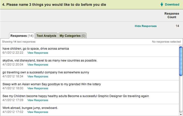


- 64.3% of the 14 people I had asked, had heard of a bucket list
- 10 people responded the second question, of which 9.1% had a bucket list
- 14 people listed 3 things they wanted to do before they died
The main activities that came up were:
- Travelling
- Skydiving
- Having children and getting married
- Getting a good job
- Skiing/ snowboarding
- Live abroad
- Be happy and healthy
---------------

I decided that rather than deciding the top ten from my all research, that I would make it more personal and include some things that I would want to do, as this is a topic close to me.
This includes things like getting a tattoo, skydiving and going travelling.
I found one young man on Youtube whose friend had cancer and unfortunatley passed away. He is now living his life for himself and his friend. He travels the world and does things that he's always wanted to do. His channel is called things to do before you die.
I found this guy very inspirational and it gave me a lot of ideas for my Top 10.
On this video he gets a tattoo of the cancer ribbon for his friend who had cancer (at this time his friend was still alive). He also gets his friends first initial. I think that the fact this young Irish man is doing this for his ill friend makes it all the more inspirational.
He then does a skydive, which looks amazing. He is just a young guy living his life to the fullest. There are so many different things that he does. I do believe he does something new each week. There are other things he does such as streaking in public, zorbing, paragliding, bungee jumping and many more. His videos are all home made which makes it more personal to him, and there is always happy music playing. Which had helped me to decide on an audio for my moving image.
Subscribe to:
Posts (Atom)