Monday, 21 November 2011

Design for print// Print task 4: Specialist production and definitions..

Task:

Based on the terminology and examples introduced during this session, extend your awareness of the diversity of print production methods in relation to professional design practices discussed. See how this impacts on what you have learnt so far and how it might affect your personal interpretation of print issues around the 4 core areas below.
  • Branding and Identity
  • Packaging and Promotion
  • Publishing & Editorial
  • Information & Wayfinding


LOOK AT:
How the Pantone Matching System (PMS) works.
What exciting alternatives different stock/substrates can provide in terms of options.
How you might collaborate/interact with specialists
How the same problem might be solved in different ways.

----------------

As a designer it is important to understand about print and how it can not only effect the way our designs look but it can also effect its message. We dont necessarilly need to know the ins and outs of a printer and all that jazz, but it is priceless to know about print finishings, formats, and stock, basically all of the things that will effect our designs. Printers tend to hate Graphic Designers because we are normally clueless when it comes to print.

I have previously looked at other print methods and how they are used within particular areas of Graphic Design, now I am going to look at specialist printing and how we can use different methods of producing a similar outcome.

---------------
All of these four areas use print as part of their practise, they have to think about how they will print their designs, how much it will cost, and what will be the best way of printing to help communicate thier message. After learning a lot of new things about print I can now understand and appreciate how things are done and how skillfull a printer really is. Its not just about laser printers and gloss or matte stock. Print is a whole new world and there are so many things you need to consider when designing for print!

There will be the obvious like stock, colour, format and costing, but there is so much more to it. What about spot colouring, metallics, foiling, embossing, debossing, spot varnish, flocking, print process, diecutting..the list goes on. As a designer we have to be knowledgable enough in terms of print to know what all of these things are and how they will effect our final piece of communication. You could have a good design that communicates everything you needed it to, but if you use an unsuitable printing method or finish, it could change the whole message of what you are trying to communicate. It is about finding a perfect balance between what you are trying to communicate and how you will print it. If you can understand print you will be on a winner!

---------------

Branding  and Identity:


-------------


--------


------------


-------------


------------

Packaging and Promotion:


------------

Publishing and Editorial:


-----------


    Wednesday, 2 November 2011

    Design for print// Exhibition design research..

    As part of the research for my Good is brief, I have decided to start looking at existing exhibition design to gain an understanding of how a space can be used creatively to utilise it in the most effective way. I also want to look at the ways in which they use print to promote the exhibition and how they place print design in the desired atmosphere and what effect this has on how their target audience will perceive the message they are trying to convey.

    The first source I have looked at is Behance//

    ----------------


    This event has used wall vinyls, these would be printed onto sticker 'like' stock and carefully stuck to the wall, sometimes these can be painted on but it depends on time and size.


    Bags are another important aspect if you are wanting to give away something at the end or within your event. The bags need to be eye catching so that they attract new customers at your event.


    This exhibition has kept the theme of red throughout their print which gives visual consistency. They have used a lot of wall vinyls within their exhibition which shows information and titles of work.


    There is then the outside promotional material which will need to be printed at a large scale and on weather proof stock so that it can be seen for longer.


    There are so many different things to consider in terms of print, when designing something for a big event. You have the pre-event promotion which includes billboards, mailshots, invitations and flyers. You then have the event day print, which includes wall vinyls, floor vinyls, information booklets, guides, catalogues etc. Each one will have different specifications when it comes to print, including format, stock and cost. As a Graphic Designer it is important to understand these elements in order to deliver to the client what they want and need.


    ---------------------


    Work can also be produced as smaller sections that can be put together to make one larger exhibition. This is shown in the above image, it maybe that it is cheaper to print multiple small images rather than one larger one.

    -------------------


    This shop has used wall vinyls to decorate their space to make it more attractive and entising to passersby. The illustrations make it fun and eye catching. The design has also been used on the flooring of the space to continue the theme.


    They have then continued the theme of illustration through onto flyers for the shop.

    ---------------


    This leaflet is for a shop that sells all sorts of random objects of all sorts of colours. They have used the space of the leaflet to intertwine images of what they sell. Seperating them into colours within the image, the leaflet looks like a piece of art work, but it is actually a piece of info graphics.


    This is a mailshot to send out to target audiences about the shop and what is available. Elements have been taken from the leaflet and used in the mailshot, but not the colourful image.


    Here is the leaflet in context with its relevant surroundings.


    The same logo has then been used as a wall vinyl for the entrance to the shop space, with more vinyls showing information about what the shop is and provides.

    ----------------


    This exhibition has used solely wall vinyling to show pieces of design and information. This method of print is used a lot for high end design exhibitions because it looks sophisticated and more professional.

    -----------------


    I really liked this information guide, as it folded out which means it could hold more information. It also makes it more interactive to the target audience as they have to touch it and open it in order to find out the information.


    This digital exhibition space is really cool, it allows you to see what goes where and how you can design a space to reach its maximum capacity.

    -------------------


    This was my favourite exhibition space design that I found. They again use vinyls as part of their print design, but they also print onto huge panels that hand from the ceiling and fixate onto interior 'scaffolding'. I really love the raw industrial feel of the space and how they have utilised the space with their designs and creative thinking.

    -------------------


    This is a good example of branding and identity. Everything has a visual consistency and you can see that it all works as part of a set or alone.


     I also picked up on this look book that uses a lot of imagery. I am wanting to create a look book based on everything polka dot related, but mainly fashion which means I can use photography.

    -----------------


    This exhibition was designed for a democratic voting event. They have used vinyls, flyers, leaflets, a guide and also signage on sticks to promote and inform about the event. They have kept a visual consistency between all design work so that their target audience knows that the information is all linked.

    ----------------------


    Thursday, 27 October 2011

    Design for print// Billboard research..


    As part of my research and ideas for the design for print// Good is.. brief, I am going to propose some billboard designs to promote polka dots at a large fashion event. I am going to look at what they are and how they are used and what effect they have on communication and advertising.
    ---------------

    'A billboard (also called a "hoarding" in the UK and many other parts of the world) is a large outdoor advertising structure (a billing board), typically found in high traffic areas such as alongside busy roads. Billboards present large advertisements to passing pedestrians and drivers. Typically showing large, ostensibly witty slogans, and distinctive visuals, billboards are highly visible in the top designated market areas. Bulletins are the largest, most impactful standard-size billboards. Located primarily on major highways, expressways or principal arterials, they command high-density consumer exposure (mostly to vehicular traffic). Bulletins afford greatest visibility due not only to their size, but because they allow creative "customizing" through extensions and embellishments.
    Posters are the other common form of billboard advertising, located chiefly in commercial and industrial areas on primary and secondary arterial roads. Posters are a smaller format than bulletins and are viewed principally by residents and commuter traffic, with some pedestrian exposure.' Wikipedia


    These are the standard billboard sizes dependant on how many sheets are used.

    -------------


    The images above show the costing and size of the billboards available by this particular company. It gives me a rough estimate of how much billboard advertising would cost.


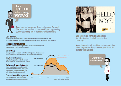
    This website came in very handy! Its a company that sells billboards and allows you to pick the location and size of your billboard to meet your specific requirements. This is really useful because it means you can choose an area where you know your advertisement will be seen by your target audience. For example if I was to create one based upon polka dots in contemporary fashion I could have it placed in a town centre where the main shopping area is. Meaning that those who are buying clothes in the city centre may likely to be interested in fashion and would see my billboard, which they could then relate to.

    --------------

    Billboards gallore..