
As part of the research for my Good is brief, I have decided to start looking at existing exhibition design to gain an understanding of how a space can be used creatively to utilise it in the most effective way. I also want to look at the ways in which they use print to promote the exhibition and how they place print design in the desired atmosphere and what effect this has on how their target audience will perceive the message they are trying to convey.
The first source I have looked at is Behance//
----------------
This event has used wall vinyls, these would be printed onto sticker 'like' stock and carefully stuck to the wall, sometimes these can be painted on but it depends on time and size.

Bags are another important aspect if you are wanting to give away something at the end or within your event. The bags need to be eye catching so that they attract new customers at your event.

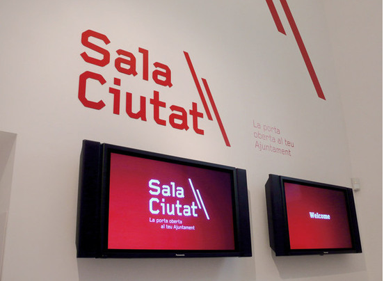
This exhibition has kept the theme of red throughout their print which gives visual consistency. They have used a lot of wall vinyls within their exhibition which shows information and titles of work.


There is then the outside promotional material which will need to be printed at a large scale and on weather proof stock so that it can be seen for longer.

There are so many different things to consider in terms of print, when designing something for a big event. You have the pre-event promotion which includes billboards, mailshots, invitations and flyers. You then have the event day print, which includes wall vinyls, floor vinyls, information booklets, guides, catalogues etc. Each one will have different specifications when it comes to print, including format, stock and cost. As a Graphic Designer it is important to understand these elements in order to deliver to the client what they want and need.
---------------------


Work can also be produced as smaller sections that can be put together to make one larger exhibition. This is shown in the above image, it maybe that it is cheaper to print multiple small images rather than one larger one.
-------------------


This shop has used wall vinyls to decorate their space to make it more attractive and entising to passersby. The illustrations make it fun and eye catching. The design has also been used on the flooring of the space to continue the theme.

They have then continued the theme of illustration through onto flyers for the shop.
---------------

This leaflet is for a shop that sells all sorts of random objects of all sorts of colours. They have used the space of the leaflet to intertwine images of what they sell. Seperating them into colours within the image, the leaflet looks like a piece of art work, but it is actually a piece of info graphics.

This is a mailshot to send out to target audiences about the shop and what is available. Elements have been taken from the leaflet and used in the mailshot, but not the colourful image.

Here is the leaflet in context with its relevant surroundings.

The same logo has then been used as a wall vinyl for the entrance to the shop space, with more vinyls showing information about what the shop is and provides.
----------------


This exhibition has used solely wall vinyling to show pieces of design and information. This method of print is used a lot for high end design exhibitions because it looks sophisticated and more professional.
-----------------


I really liked this information guide, as it folded out which means it could hold more information. It also makes it more interactive to the target audience as they have to touch it and open it in order to find out the information.


This digital exhibition space is really cool, it allows you to see what goes where and how you can design a space to reach its maximum capacity.
-------------------


This was my favourite exhibition space design that I found. They again use vinyls as part of their print design, but they also print onto huge panels that hand from the ceiling and fixate onto interior 'scaffolding'. I really love the raw industrial feel of the space and how they have utilised the space with their designs and creative thinking.
-------------------

This is a good example of branding and identity. Everything has a visual consistency and you can see that it all works as part of a set or alone.


I also picked up on this look book that uses a lot of imagery. I am wanting to create a look book based on everything polka dot related, but mainly fashion which means I can use photography.
-----------------


This exhibition was designed for a democratic voting event. They have used vinyls, flyers, leaflets, a guide and also signage on sticks to promote and inform about the event. They have kept a visual consistency between all design work so that their target audience knows that the information is all linked.
----------------------
No comments:
Post a Comment