Tuesday, 29 March 2011

What is a line?...

Lucinda Rogers


I really like Lucinda's style and visual interpretation of cityscapes, her style is very loose. She sketches the city roughly and then adds watercolour to bring it alive. I think the way in which she highlights particular parts with the stroke and dashes of colour, gives her a unique style, her work portrays the hustle and bustle of a city through soft colours and simple lines, she shows it in its opposite by what media she uses.

--------------------

Andrew Prokos


Prokos is a cityscape photographer, a lot of his work is of the New York skyline and cityscape, his style is something that i am aiming for, to then simplify through tracing. I want to take pictures of various cityscapes/ skylines then take them down to their simplist form, so you can tell its a big city (for example) by the shapes interupting the skyline, but u will not be able to see the big picture.

----------------------

Jessie Douglas


Jessie Douglas takes parts of a cityscape/ landscape and isolates it, she then uses a vector illustrating to create these simple sections of a much bigger picture. I like her simple style and how she picks a busy section, but when taken out of context and placed on a block background she makes it look a lot simpler.

-----------------------

Flickr


--------------

Reza Abedini
Poster for solo exhibition, 2006


This poster design is from a book i own called 'New poster Art', the style of this poster is the direction in which i am going to take my work, the designer has taken the human form but stripped it down to its simplest form of just an outline, giving an odd looking shape. These are then overlayed to create an entanglement of lines, its a really nice technique, it keeps it simple and interesting to look at.

------------------

Michael Gericke
'Building the Empire State', The Skyscraper Museum, exhibition poster, 1998


-----------------

Tyson Roberts


------------------


------------------

Stephen Wiltshire


Stephen Wiltshire's work is amazing. His only tool is a pencil, and he creates these brilliant large scale pencil drawings of big cities. There is an example above where you can see the huge scale he works too, which is all hand drawn, it's a panoramic view of London and The River Thames. I really like his sketchy, but accurate style, its more detailed than what i am wanting to do, but it shows me another way of interpreting the city.


Monday, 21 March 2011

Communication is a virus...Typeface research...

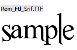
I used the website Dafont to find some typefaces that i thought would work well in my poster designs, i wanted some that were fairly simple and others that already had a hand drawn quality to them.


I chose to use circus because it looks fun and has a hand drawn element to it already, if i hand drew it myself it would add to that quality.


I think Pauls ransom note was appropriate to use because each letter looks like a different typeface and the way they look wonky in the boxes makes them look hand drawn again.


Monbijoux is a favourite because each letter is different, which makes it really fun and again has a hand drawn quality to it.


I have used this one a fair bit when i want to make a word stand out, because its so bold and it has a shadowed outline it just seems to stand out well. Again i like the uneven curves of the s,a and e, it gives it a hand rendered look.


This one looks like text book doodling type, i also like how the letters, when next to one another lean to different sides rather than just being straight and normal.


I really like this one because the counters of the letters have been blacked out and i like the round, bubbly shapes.


I didnt want all the typefaces that i used to be 'hand drawn', so i picked a few that looked more digitised such as nouvelle vague and Harabara, i figured if i used to many decorative fonts then my poster would look like it had too much going on.


Communication is a virus...research...

Anthony Burrill

It was suggested that as a group we looked at existing typographic poster designs to see what had been done and what worked well. One designer that we were advised to look at was Anthony Burrill, his posters were mainly type based and he focused on quotes about life and general things. The type faces he uses are fairly simple where as ours as a group are a mixture of simple and slightly more complex.


I really like his poster designs, the statements that he has on his designs are short and sweet, but really make you think, they are quite inspirational. The colours that he uses varies from bright colours to toned down neutral ones. His style may not help us with our designs but his content does and the way he portrays it.

----------------------

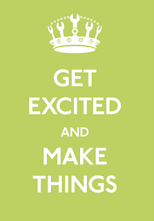
The keep calm collection has become widely popular and a lot of new designs have come about where people make up their own content but keep the style similar to the original. These posters are fun and sometimes quirky, the colours that are used are always eye catching and the small illustration used makes the content more understandable and clear. 


--------------------------

With the posters below, i put in Google images 'motivational posters' and these came up. The design is very literal and i like the use of photography. They are inspirational but i dont feel they have the same great effect as the ones that use solid colour, although that may just be personal preference.


--------------------------