
I used the website Dafont to find some typefaces that i thought would work well in my poster designs, i wanted some that were fairly simple and others that already had a hand drawn quality to them.


I chose to use circus because it looks fun and has a hand drawn element to it already, if i hand drew it myself it would add to that quality.

I think Pauls ransom note was appropriate to use because each letter looks like a different typeface and the way they look wonky in the boxes makes them look hand drawn again.

Monbijoux is a favourite because each letter is different, which makes it really fun and again has a hand drawn quality to it.


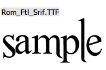
I have used this one a fair bit when i want to make a word stand out, because its so bold and it has a shadowed outline it just seems to stand out well. Again i like the uneven curves of the s,a and e, it gives it a hand rendered look.


This one looks like text book doodling type, i also like how the letters, when next to one another lean to different sides rather than just being straight and normal.


I really like this one because the counters of the letters have been blacked out and i like the round, bubbly shapes.


I didnt want all the typefaces that i used to be 'hand drawn', so i picked a few that looked more digitised such as nouvelle vague and Harabara, i figured if i used to many decorative fonts then my poster would look like it had too much going on.


No comments:
Post a Comment