

https://blogger.googleusercontent.com/img/b/R29vZ2xl/AVvXsEhtBkq78hqoz5-0UM2Jrw2I-nOv3cZrH_ZZGG037eUFIhxtX4ME-93MGcpwQ2wEjUQqgHNjfFNYrcktGH0ONRTT_Kt_YDb937TnAWgo-9TGozSNDCBXR_eyuPKzh1s9XJ3gLxn4k9RWcq4/s1600/atlanta+business.jpg
I think that the photographic and illustrative methods used for the imagery in this article work well. It makes it more engaging and more interesting to look at, whether or not the article is dull or interesting.

http://imgs.abduzeedo.com/files/paul0v2/editorial-design/ed-05.jpg
Again this uses a balanced use of photography and illustration. There is more imagery on this article which I think is more appealing to read. When you have too much text sometimes it puts you off reading something. It is also very important to have imagery with an article that relates to it or even tells you what the article is about but using images. This will help the reader understand the article more and also help them to decide if they even want to read it.

http://www.matiekiller.com/files/7612/7190/8663/ceopay1.jpg
The text and imagery for this article are quite separate from one another, you can see they relate due to the title of the article and the imagery used in context.

http://gavfeeney2010.files.wordpress.com/2010/11/nd-editorial-1.jpg
All of these examples work really well, the imagery used reflects exactly and literally what the articles are about which makes it easier for the target audience to understand and enagage with.

http://behance.vo.llnwd.net/profiles18/342595/projects/1067275/b13ed387c1bd1e50852c04b14892c4b4.jpg
I think the balance between imagery and text across the two pages works really well. The face that is split in half leads you across to the next page. This means that both imagery and text is as important as the other.

http://behance.vo.llnwd.net/profiles2/133822/projects/353527/1338221258995829.jpg
This piece of editorial works well because of the relating images. The article is about retro fashion and that is what the images show. I think it is important to carefully think about what imagery to use with an article because sometimes editorial designers try to be clever with their images and not relate them in literal way to the articles context which can cause confusion or just look crap.
http://artspacetokyo.com/images/ast_2/blog/image_uploads/guardian_article.jpg
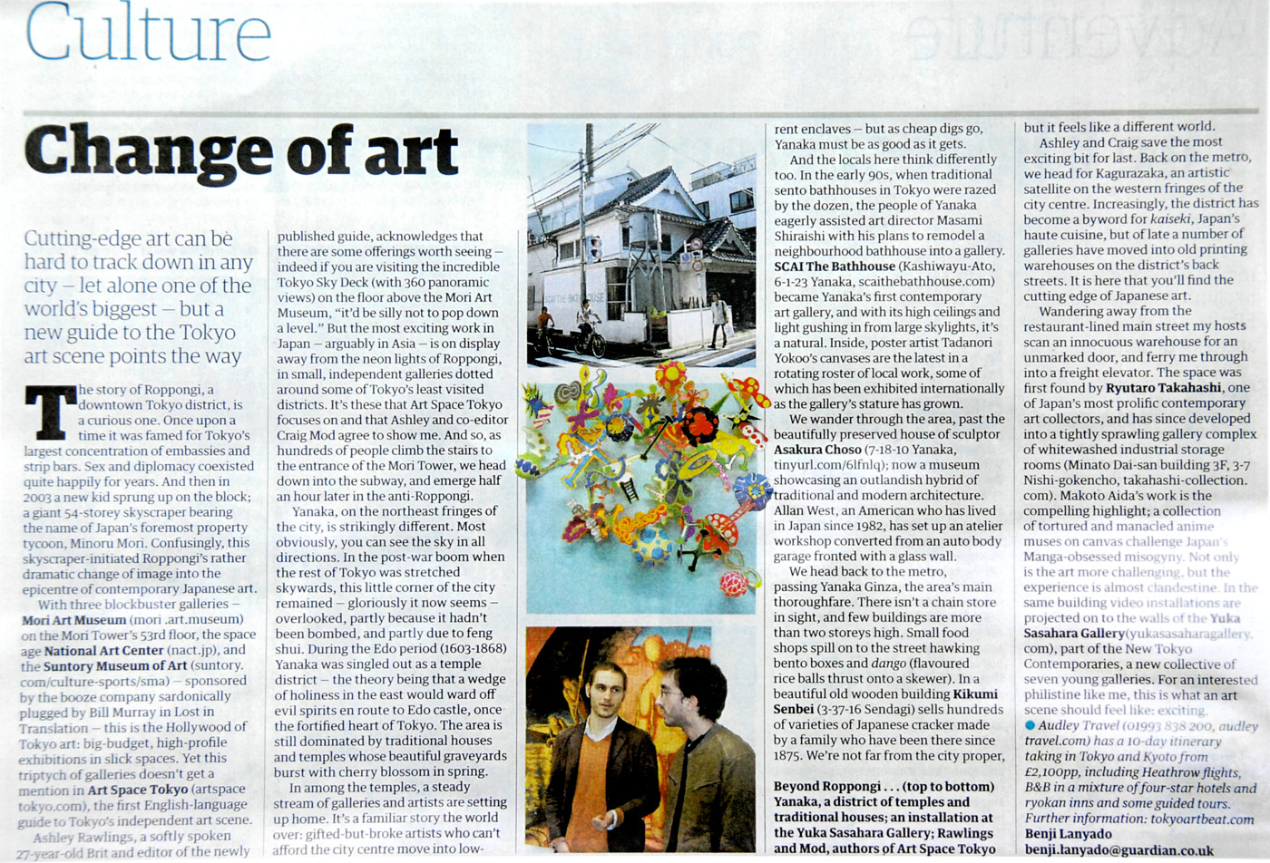
This is an article from the Guardian, I think the Guardian take a good approach with the images they use as they have a balanced combination of photography and illustration. Their articles also all have a similar layout to them and the imagery seems to have an overall tone of voice to them.

https://blogger.googleusercontent.com/img/b/R29vZ2xl/AVvXsEg8N0mjS_UB3TqIORESUhgAf91e0Bvsd57bJpXgcjEBnuXDYop7M2sLLFuI2TFfCIYwEIVZezwuSmuN7tvpbyR382cVm2iJf7h05zhSdisXJo9HuQrzaJC7CHLkvKZzieOvL60SPeJqWQts/s1600/GUARDIAN+ARTICLE.jpg
This article is also from the Guardian, I think this one works well because of the way it has been laid out and also how the two articles relate to one another.
No comments:
Post a Comment