Beta 5 Packaging
This is a complete collection of packaging and branding for a confectionery brand. The simplicity works really well across the range. You know what the product is and you can tell that is is a sustainable brand using simple design and eco friendly stock for its packaging.
They have just used plain cardboard for their packaging and then have either made a label to stick on the box or designed a sleeve to wrap around it. Its a very simple design but it works.
They have added flecks of bright colours with the actual confectionery to compliment the packaging. This works really well and goes to show that the packaging doesnt need to be flashy and bright to be able to sell a product.
I really love how they have used the coloured foils to determine what sort of chocolate it is. Its a simple way to brand the products without going overboard with very different designs to know what is what.
RNLI Confectionery Packaging
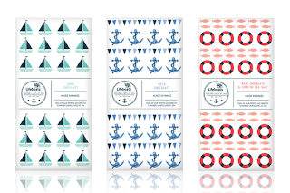
This brief was to broaden an appeal for a brand to show that it sourced its ingredients locally. The theme to the brief was 'Beautiful days by the sea'. This packaging is for chocolate and the different types have been defined by the pattern and colour on the packaging. I think this is a good idea as its visually engaging and simple to know what is what. The whole design has been kept simple.
This is a range of products with the same theme applied. It has a very traditional feel to it and fits well with the theme of by the sea. It is important to create a brand and identity for a company that will work across a range of products.
They have played around with different designs. This one is also for chocolate but its quite a bit different from the one above. It also shows a variety in how you can actually package the chocolate, either with just paper wrapping or a box. This gives me something else to think about, which method would be the most appropriate.
I really love this simple design for boiled sweets, its really clever and fits well with the given theme.
Polly Pack
I really love this simple and fun design for packaging chocolate. Its quirky and clever.
Chocolate Geneva
This design is a lot slicker than the ones above, I guess the design is reflective of the brand and its chocolate. Its more sophisticated. The design is still really simple and almost quite serious.
The range is defined by the image on the front of the packaging. This is a very simple way to identify a product, visual imagery is something I need to look at when designing my own packaging.
I really like how they have used embossing and foiling on the packaging, it gives it that sophisticated feel which fits with the identity of the brand.
Green and Blacks are famous for their wide selection of chocolate bars. They combine flavours that many brands havent thought about. This means that they would of had to have designed an identity that would work across a huge range. I particularly love how they have focused on colour to define each flavour. Its simple but it works.
On their website they have a variety of chocolate gifts which combine various products. My favourites are the square boxes which contain mini chocolate bars in different flavours.
This is the box that contains the many miniature bars. The design works really well. I love the coloured lines around the logo to represent each flavour. Then they have pictures of the mini ones at the bottom.
Here is the mountain of different flavours they have to offer. The colours are amazing and really stand out. Their packaging stands out and makes it easy for customers to find the flavour they want.
The miniature bars is something I need to look at when designing my own packaging. It is another product which could then lead to a range, therefore broadening my deliverables.
The Green and Blacks design is very sophisticated and is something I aspire my work to be like. They look classy and taste amazing.
http://www.greenandblacks.com/


hi
ReplyDeleteThis article provides insightful analysis on the impact of minimalist and sustainable packaging in the confectionery industry. As consumer preferences evolve, integrating functionality with aesthetic appeal becomes crucial. Kingchuan Packaging, a prominent name among China High Barrier Film Manufacturers, offers advanced packaging solutions that not only preserve product freshness but also align with eco-friendly practices. Their innovative films ensure that confections maintain their quality while meeting modern sustainability standards.
ReplyDelete