Tuesday, 25 October 2011

Design for print// Look Book research..


As part of the design for print brief, I have started to think about designing a look book about polka dots in contemporary fashion. I have started to research into existing look book designs and zines to gain inspiration and an understanding of how they work. I am wanting to create a look book that is simple and communicates a clear message about polka dots.


These were look book designs to promote Hip Hop icons. I particularly liked this one because of the layout of type and imagery. They have used the two in harmony to create interesting compositions. I am going to be using InDesign to create my look book, so it is important to look at as many different types of layouts and designs as possible. With this book aswell, they have kept a visual consistency with colour and a particular style of type. The colours and type used reflect on the subject matter which help to visually communicate the message of the book. By carefully selecting the colour and typefaces, it makes it clearer to understand.

-----


I looked at this design because of the way it was packaged and how there was a visual consistency between the book and the packaging it came in. The packaging became part of the book and vise verser. The packaging held the book inside a 'book' style packaging (as seen in the picture). This would be a good way to use the packaging as it would give you the chance to add other elements that would tie the book and packaging together.

-----


These caught my eye because the front covers are very simple (and they have circles on them). I want my look book to have a very simplistic layout and design to it, as the polka dot patterns themselves will make the pages seem busy. Also if the design is kept simple it will reflect on the polka dot pattern and its simplistic elements.

-----


This is a really lovely piece of design. The front cover has been diecut and the page underneath is reveresed out. This is an element I can use within my own look book. I also like the contents page which has a very simple layout. There will be text within my look book, but it will mostly contain imagery and illustration/ vector images. When I do use text I want it to be creatively laid out.

-------


This caught my eye because of the layout of the image, type and vector shapes. They work really well together, and although the layout design is slightly more complex, the colours keep it simple and visually consistent. I also like the use of semi and full circles and how the type overlays these. Again this is something I could do within my own designs.

-------


This is a look book that has used imagery only, I wanted to see what it looked like and if it would work well. Obviously it all depends on the content, but this layout seems to work very well. I will be using photographs of polka dot clothing in contemporary fashion, so this will allow me to gain inspiration from pure imagery books and how they communicate a message without words.

-------


I also found this really cool zine on the Behance website. The 'obvious' pages have illustrations on them, but each one then has perferations which open up to more pages with text and explanations of the illustrations. It is a really creative way of adding depth and interaction to a piece of design. It allows the audience to discover new parts of the book on their own accord, which gives them a sense of control. I also like how they have printed on red stock and just using black for the text and illustrations.

-------


This design caught my eye because of its simplistic design and use of geometric shapes. They have used lines to define the shape on the front cover without actually using the shape, it is then used on the back cover too. It would be interesting to use elements of stripes within my look book, as spots vs stripes have also been a big concept within fashion.

-------


This look book is of higher quality than most of the above examples. It uses a hard back cover and embossing. The front cover has a very lovely feel to it, they have only used the embossment to define the title, which leaves it very subtle. I really like the use of space within the pages as they have filled each one carefully. The first dps is just a pattern but it works really well without text. The second dps uses text but it blends in with the imagery, and the planet shapes blend in with the background to make the whole dps feel as one.

--------


This is another example of creative use of layout and page format. This uses folds and pop ups to add depth and interest to its design. It makes good use of space and format, it allows the designer to use larger formats that fold down to a consistent size. This would be a good way to incorporate poster designs into the smaller look book format (which could also use perferation elements from one of the previous design examples).

------


This design uses the wrap around as a seperate folded out poster, which again allows the designer to add another format without them being two seperate things. This design also uses embossing on the front cover, which has been kept the same colour as the stock. I like how the design works as one piece together or two seperate designs.

-------


Monday, 24 October 2011

Design for print// Study task 4: Specialist production and definitions..

Task:

Based on the terminology and examples introduced during this session , extend your awareness of the diversity of print productin methods in relation to professional design practices discussed. See how this impacts on what you have learnt so far and how it might affect your personal interpretations of print issues around the four core areas below:

- Branding and Identity
- Packaging and Promotion
- Publishing and Editorial
- Information and Wayfinding

It is important that you identify and evaluate unfamiliar products , contexts and functions of design for print as this will help you to develop a broader and more informed understanding of the specialist nature of print production.

-------------

All of these four areas use print as part of their practise, they have to think about how they will print their designs, how much it will cost, and what will be the best way of printing to help communicate thier message. After learning a lot of new things about print I can now understand and appreciate how things are done and how skillfull a printer really is. Its not just about laser printers and gloss or matte stock. Print is a whole new world and there are so many things you need to consider when designing for print!

There will be the obvious like stock, colour, format and costing, but there is so much more to it. What about spot colouring, metallics, foiling, embossing, debossing, spot varnish, flocking, print process, diecutting..the list goes on. As a designer we have to be knowledgable enough in terms of print to know what all of these things are and how they will effect our final piece of communication. You could have a good design that communicates everything you needed it to, but if you use an unsuitable printing method or finish, it could chnage the whole message of what you are trying to communicate. It is about finding a perfect balance between what you are trying to communicate and how you will print it. If you can understand print you will be on a winner!

------------


This is a good example of how print has been effectively used in design for print. They have thought about the different print processes and how they will effect the design and its communication purposes. The front cover has used diecutting, foil blocking and embossing, there would also be hand finishing for the string that has been placed through the die cut holes. I am guessing that this print run would have cost a lot of money. This is where it is important to start buliding relationships with printers, so that they will not only be willing to help you out but they may even begin to give you discounted prices.

Wednesday, 12 October 2011

Print finishing (ooooooo)..

As part of the print module I have been looking at different aspects of print that relate to commercial printing and elements to think about when designing work for print. So far I have looked at printing methods and colour process, now I am looking at print finishes, so things like spot varnishing and embossing. I found a selection of different designs that use various print finishes.


This is a very old nursery rhyme book that I bought from a charity shop last year. It uses a print finish down the spine, it appears to be gold foiling over the text. It gives a really nice finish and the gold works well with the faded red cover.


This is a business card that I got when I did volunteering a few years ago. The card is made of three layers, which then has white spot varnished embossed text. Its a really top quality business card. The District is a Cambridge based design studio where I am trying to arrange a visit to. The business card design definetly reflects on the design work that they produce, its very contemporary.


This is a train ticket that I used when I went to Amsterdam early this year, I have chosen this because it has a holographic strip on it. Im not entirely sure if this would be an element that would be printed during/ at the end of the printing process. I guess in a way its like foiling.


I really liked the feel of this stock on this Guinness clothing tag, it has a matte finish to it. It does look like the gold harp and 'official merchandise' text has used gold metallic spot colouring, it does have a slight shimmer to it in the light but not as much as foiling would.


Christmas tags often use print finishings to add a festive sparkle to christmas cards, wrapping paper and gift tags. This is an example of a gift tag that uses foiling within its design to add a festive element. With using foiling as a print finish in a design you will find that if it is used appropriatly it can really make a design look amazing. If it is used willy nilly it will break a peace of design.


This is a H&M gift card holder, they have used a laminate on the outside and then foil blocking on the logo. It works well because it reflects on their clothing lines, its colourful yet sophisticated.


This is a club promotion flyer. It has been printed onto a matte card but then has spot varnishing on the rainbow coloured circles. I was surprised to see such a good quality club flyer as I thought they would have them printed as cheap as possible. Unless they just got a very good deal with a printers.


Birthday cards are something that use a lot of print finishes to add a particular feel to the final design. This card uses embossment and I think it works really well with the rest of the design. The flowers that have been embossed arent printed so they are very subtle.


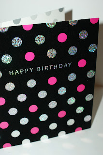
This birthday card uses flocking, which is velvetty material, it also uses foil blocking in the polka dots and spot colouring for the others. I imagine this would of been an expensive design to print as there are so many print elements to it.


Being a student and still living in halls, we always get take away menus shoved under the door. Most of them look like really crap designs and I dont even bother looking through them. But this one caught my eye. It has used metallic inks which I thought was really interesting. Its not very often you get a take away menu that makes an effort to have a decent menu designed.
----------------------

Branding and Identity


This business card designs are really cool. They are printed onto plastic with raised text. Im not sure if this would count as embossing as I dont know if it only works on paper stocks. It just makes a change to see a business card to printed on something other than card.


This business card uses embossing but with no colour. I love how subtle the text is, designs that use embossing just make you want to touch them. I must add that it does make it harder to read but it does look pretty cool too.


These business cards are amazing! It looks as though they have used embossing and debossing for the logo, and then to make it even more glamorous they have used metallic/ holographic card between the two sides. They are just BEAutiful!


These remind me of coasters! They have used debossing for the logo and designed these to be thick so they can make the debossing very deep.


This business have used foil blocking on their business card, the colour works really well with the white of the stock. I think its very clever how the foil has been used around the small text, its great attention to detail and you can see alot of thought and care has been put into this design.

--------------------

Packaging and Promotion


Packaging is another practise where you have to think carefully about how you package a product. These packaging designs are for wine, they have used foil blocking and diecutting (really pushed the boat out). It seems like a really complex design. The foil blocking is on the white label and the diecutting is the logo which looks through to spot coloured stock.


This design is a label for a wine bottle, they have used metallic inks (im guessing). I dont think it would be foil blocking as its been printed using the PAD process. It looks very sophisticated, as you would think for a fine wine bottle.


I particularly liked this design because of the way it has used diecutting. They have diecut a pattern on the bag and then used embossing underneath for the business logo. I like how it has a colour underneath rather than the other side of the bag. As part of the 'Good is' brief, I want to look at designing a shopping bag for a polka dot boutique store.


This is a christmas card pack that uses diecutting and foil blocking on the packaging. The diecut reveals another pattern which adds another element to the design. Diecutting always adds another dimension to a design and it s very interesting to see how designers utilise this extra space. The foil blocking adds a festive element and works well with the colours used in the rest of the design.

----------------------

Publishing and Editorial


This book was designed to promote how Nokia has something for everyone. The designer has used embossment on the front cover along with the one word spot colouring. It is so much more creative than just having the one blue word on the front. I think embossing works best when it is subtley used like this.


This is a small booklet that uses diecutting. I think its amazing how fine the cutting is in this design. It would interesting to find out how finely you can diecut something.


This book cover uses foil blocking for the main title and important information. The gold works really well with the black and the white stock. I like how they have used the foiling to emphasise the important bits rather than just having the whole text foil blocked.


This book cover uses spot varnishing on the black ink. I like the combination of recycled stock and slick, varnished black ink. It is a very minimalistic design but the varnish stops it from being dull.


This is a really beautiful design using foil blocking, its a theater guide for a ballet show. The colours they have used with the gold foiling works really well together. The foiling adds elegance to the design really fits with what it is for.

-------------------------

Information and wayfinding


This is an annual report for the global fund of women. They have used diecutting with an underlying colour. Again it works well because it adds depth, I guess as well that reports can be boring so having an interesting design might help people read it!


This is a small brochure for posh carpets and rugs. They have really pushed the boat out and used foil blocked embossment, which looks really good. Looks very elegant and sophisticated. Its funny how good design can effect someones decision, I would buy carpets from this place purely because they have good taste in design!


This piece of infographics use foil blocking to highlight places on a map. The colours work well together and the foiling really stands out.


This is designed for the Royal Mail to inform about their specialist services. They have used spot varnishing on a matte surface which works really well. I like how they have used a similar/ if not the same red for the stock and the spot varnishing.