Monday, 12 November 2012

Wind in the Willows illustrated book covers


I have started to look at existing book covers for Wind in the Willows to see what is already out there. I need to update my design and make it appeal to young children and their parents. This design is quite old and the illustrations are very traditional. The illustrator seems to have drawn them in a traditional way but they also have quite a modern look about them. I really like the typeface they have used as it has been kept simple in contrast with the illustrations.


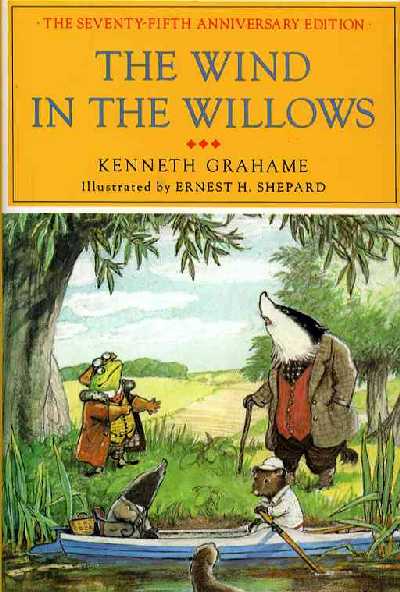
This is completely different from the one above, im not sure if the top yellow section where the type is works very well with the illustrations. The only good point about it that I have noticed is that all of the characters are looking up at it which makes you read it, but then this may detract from the characters themselves. It depends what would be considered more important when it is sitting on a book shelf.


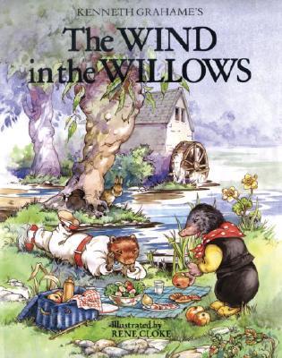
This has a very traditional feel about it, they have used water colours and it is very 'arty'. I think its all a bit too fussy for a childrens book and I am wanting to design something that is practically the opposite to this. Even the type doesnt work too well, the way the two smaller words are placed just doesnt look right.


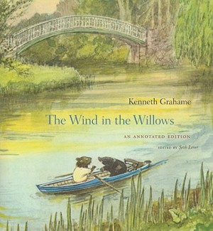
This design is lovely and one of my favourites from the ones I have found. The illustrations are simple and very cute. I think the way they have laid it out works really well with the type being placed in the space of the water. Everything is centered and the typeface fits well with the style of illustration.


This one is a lot more modern than some of the previous. The images look very soft and again have been kept simple. I think this type of design approach is a lot more child friendly and would appeal more to the younger child. The only thing that I dont really like or think works is the type face, its a bit too fussy for my liking and I am not 100% sure it suites the rest of the design.


Again a very traditional design approach that I dont particularly like, but its good to look at the old and new to give me some perspective. I guess these designs arent that bad as there are so many like it and they sell.


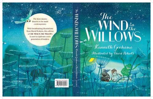
This is another one that I really like, its good to see the back and the front of the cover to give an idea of how the whole spread will work. The design for this is very modern, I particularly like how magical it feels and it will be very attractive to children.


I really dont like this design, the illustration and the typeface just dont do it for me.


I like the green typeface on this one but the typeface for the author is too fussy and doesnt fit with the rest of the design.


I like the illustration on this design but the typeface looks a bit tacky. I think its supposed to look like wood but it hasnt really come out that well.


Chocolot Brief: Sweet jar research


I have been looking at different jar labels and designs for my chocolot brief. I am wanting to have a jar with a really cool label design for one of the flavours. I think it will fit well with the other packaging ideas and the concept behind my chocolate brand.


This is a really good design. Its simple and fits with the personality of the sweet, which I think is very important. I like the idea of the paper and string for the lid it just makes it that bit different from the standard lid sticker.


I really like the jar shape on this one as its not a standard shape. The label isnt very exciting but again this maybe to show the personality of the sweet. They have purposely kept it simple.


This shows a different way to apply the label to the jar. The design isnt amazing but the concept is something to consider. 


I like how this jar design has been kept really simple. The information is all on the tag. I think its really nice how the contents of the jar has been set in layers. Not too sure about the ribbons as it looks a bit tacky. I like this type of jar too and I am thinking of using one for my design.


This is a really lovely design. Its simple and sophisticated. I like how they have not tried to complicate it. The only thing is that when they have opened the jar they will most likely rip the label.


This is similar to one of the above designs apart from the label is round and the labels dont look as tacky. I think the way they lay out the contents is really nice, it might be worth me thinking how I could do this with my designs.


I like this one because they have a design on the ribbon and then the sticker on the lid too. Its very simple and cute.


This is probably my favourite out of the ones above. Again the contents is in lots of layers which makes it more interesting and the label is really simple and works well with the contents. This is the type of thing I want to create with my designs.


Wednesday, 24 October 2012

Chocolate packaging design


This chocolate bar and packaging is so simple but amazing. Sometimes I dont think it is necessary to over complicate designs. I do like working in a simplistic way. As much as I do like the packaging I think with my own designs I will be using colour as one of my main tools. Colour can tell a story and give life to a piece of design.


This is a clever design and something I could incorporate into my own designs. They have used dye cutting to create the butterflies using black and just one colour to define them, which means the dye cutting brings the butterfly to life. When you think about it, the idea isnt that complicated but works really well.


This use of foiling is beautiful on this packaging, it is the sane brand as the one above. They have obviously focused a lot of print processes and simple ways to make their packaging stand out from other products. This is something I really need to think about with my designs.


I love these! It is such a simple idea but works so well. They have made this interactive by allowing people to place the packaging over their faces to look like a pig when eating the chocolate. Its a good way to appeal to customers as its fun.


I think the simple use of colours to define the different flavours works well. Although I am not too keen on the typeface.There is also maybe a bit too much brown as the text is a bit lost on some of the packaging.


This chocolate is made by the same designer as the first image on this post. Again it has a very simple design. I like how they have used different chocolates to define the pie chart.


These little chocolates are very cute and the simplistic colours and type work well. The packaging seems very design led rather than trying to communicate the fact its chocolate packaging (if that makes sense).


I love the pretty pattern on these designs, it makes them look very elegant. The logo works well with the pattern as it has a hand drawn feel to it. I also like the colours they have used as they have not needed to change the colour of the pattern there is a good consistency throughout the designs.


For some reason these reminded me of Pantone swatches which im not not if its a good or a bad thing. I do like the simplicity and I think it works really well.


The colours of these are amazing, they really stand out and make the packaging come alive. I think there is a bit too much going on though in terms of the colour, pattern and different typefaces. I was thinking of using bright colours for my different chocolate designs to help define and communicate the different flavours.


I like how they have used the logo to create a pattern for the inside of the packaging, its really simple and a clever way to use the logo. The packaging design itself is also good as its not a standard box, its an envelope. The whole concept makes you feel happy and that is obviously the concept behind the design.


I love everything about this. The colours, the design and the print processes used. You can tell that the white has been embossed and feels lovely and it contrasts so well against the bold colours. I then noticed they have dye cut the logo so the chocolate can be seen through the packaging which is something I had not thought about.


This is yet another simple, yet lovely design by Mary and Matt. I just love how simple they have made all of their packaging.


I like how the chocolate bar slips out from the side rather than from the top and the shape of the bar works well too, its just very different and is not like something that is already out there.


Tuesday, 23 October 2012

Chocolate moulds

After having a one to one tutorial with Andy and discussing my ideas. We came up with the idea of thinking outside of the box with one of my designs. I had designed foil that would be wrapped around the chocolate, on the foil there was a pattern which would tell the flavour of the chocolate. Instead of having the flavour printed onto the foil we thought about having the design actually printed onto the chocolate and then the foil wrapped around would just be the colour, ie mint would be green.

I started looking into chocolate moulders and found it quite difficult to find one that made them to your specific designs and needs. I eventually came across one in Halifax that specialised in making personalised chocolate moulds. I emailed them with an inquiry and didnt hear back so decided to ring them. In my email I did tell them I was a student and the mould would be for a brief. I soon realised why they didnt get back to me.

£400 for a mould!

Time to re think my designs, although there is no harm in proposing this. It is a shame though that I wont be able to actually do it.

http://www.chocolatemoulddesigns.co.uk/

Monday, 15 October 2012

VW advert research


Images from 'Remember those great Volkswagen ads?'

These images were taken from a book full with old VW adverts. It has been very helpful in helping me understand how simple the Beetle adverts in particular are. A lot of them are one liners with a picture of the car. I think that its going to be hard for me to think of something original and clever within my own ads as it seems that VW know what they like and know what works.

Confectionery Brief research/ Branding and Identity

Beta 5 Packaging


This is a complete collection of packaging and branding for a confectionery brand. The simplicity works really well across the range. You know what the product is and you can tell that is is a sustainable brand using simple design and eco friendly stock for its packaging.


They have just used plain cardboard for their packaging and then have either made a label to stick on the box or designed a sleeve to wrap around it. Its a very simple design but it works.


They have added flecks of bright colours with the actual confectionery to compliment the packaging. This works really well and goes to show that the packaging doesnt need to be flashy and bright to be able to sell a product.


I really love how they have used the coloured foils to determine what sort of chocolate it is. Its a simple way to brand the products without going overboard with very different designs to know what is what.

http://www.behance.net/gallery/Beta-5-Packaging/4883837


RNLI Confectionery Packaging


This brief was to broaden an appeal for a brand to show that it sourced its ingredients locally. The theme to the brief was 'Beautiful days by the sea'. This packaging is for chocolate and the different types have been defined by the pattern and colour on the packaging. I think this is a good idea as its visually engaging and simple to know what is what. The whole design has been kept simple.


This is a range of products with the same theme applied. It has a very traditional feel to it and fits well with the theme of by the sea. It is important to create a brand and identity for a company that will work across a range of products.


They have played around with different designs. This one is also for chocolate but its quite a bit different from the one above. It also shows a variety in how you can actually package the chocolate, either with just paper wrapping or a box. This gives me something else to think about, which method would be the most appropriate.


I really love this simple design for boiled sweets, its really clever and fits well with the given theme.


Polly Pack


I really love this simple and fun design for packaging chocolate. Its quirky and clever.


Chocolate Geneva


This design is a lot slicker than the ones above, I guess the design is reflective of the brand and its chocolate. Its more sophisticated. The design is still really simple and almost quite serious.


The range is defined by the image on the front of the packaging. This is a very simple way to identify a product, visual imagery is something I need to look at when designing my own packaging.


I really like how they have used embossing and foiling on the packaging, it gives it that sophisticated feel which fits with the identity of the brand.


Green and Blacks are famous for their wide selection of chocolate bars. They combine flavours that many brands havent thought about. This means that they would of had to have designed an identity that would work across a huge range. I particularly love how they have focused on colour to define each flavour. Its simple but it works.


On their website they have a variety of chocolate gifts which combine various products. My favourites are the square boxes which contain mini chocolate bars in different flavours.


This is the box that contains the many miniature bars. The design works really well. I love the coloured lines around the logo to represent each flavour. Then they have pictures of the mini ones at the bottom.


Here is the mountain of different flavours they have to offer. The colours are amazing and really stand out. Their packaging stands out and makes it easy for customers to find the flavour they want.


The miniature bars is something I need to look at when designing my own packaging. It is another product which could then lead to a range, therefore broadening my deliverables.


The Green and Blacks design is very sophisticated and is something I aspire my work to be like. They look classy and taste amazing.

http://www.greenandblacks.com/